Project details
Explore the design work shown for this brand.
- Brand
- Bee Dry Water Damage Restoration
- Work shown
- Logo Design, Truck Wrap Design, Uniform Design
- Design team
- Kongify
Source: The designs shown on this page.
Meet the Kongify team
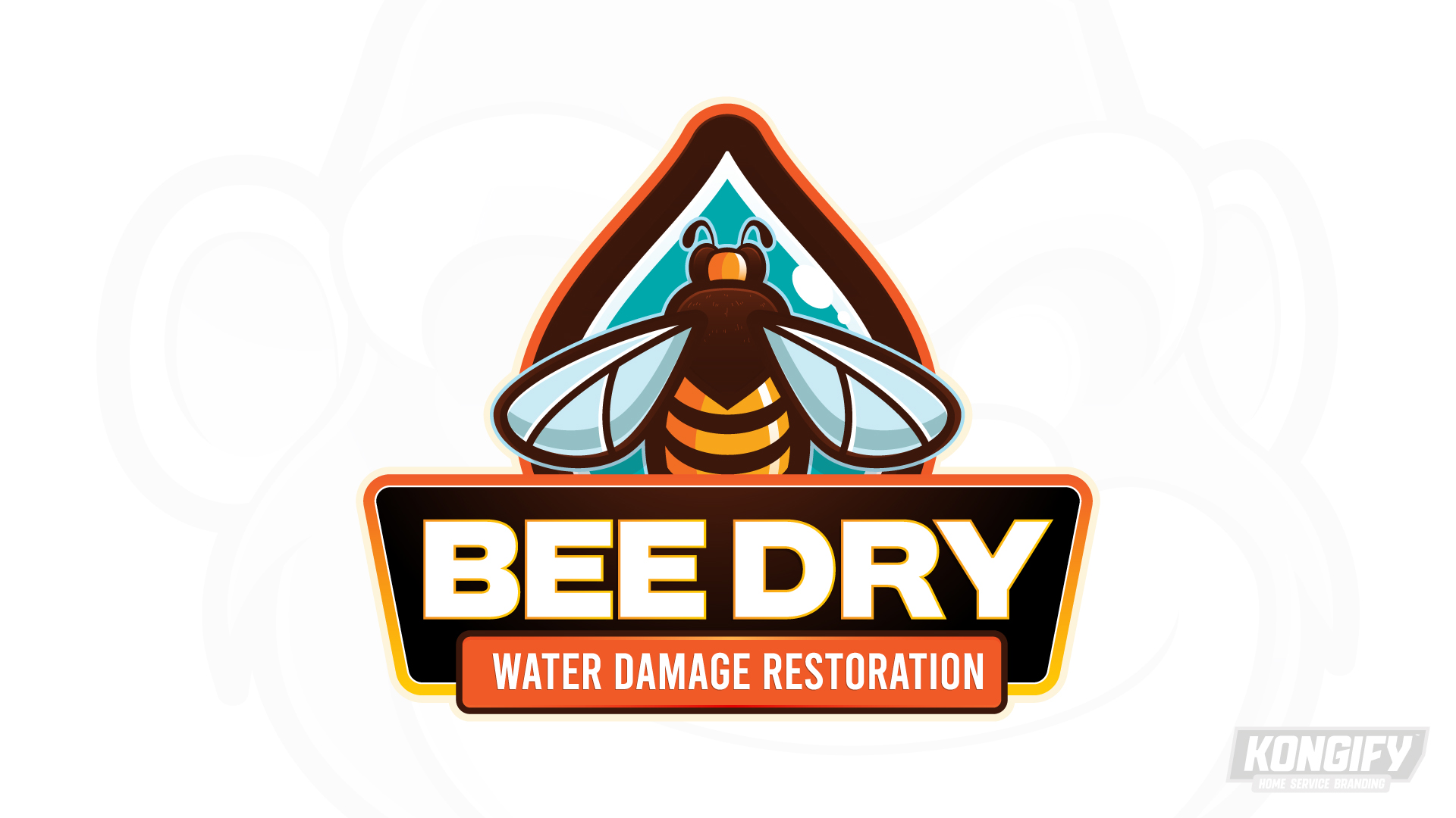
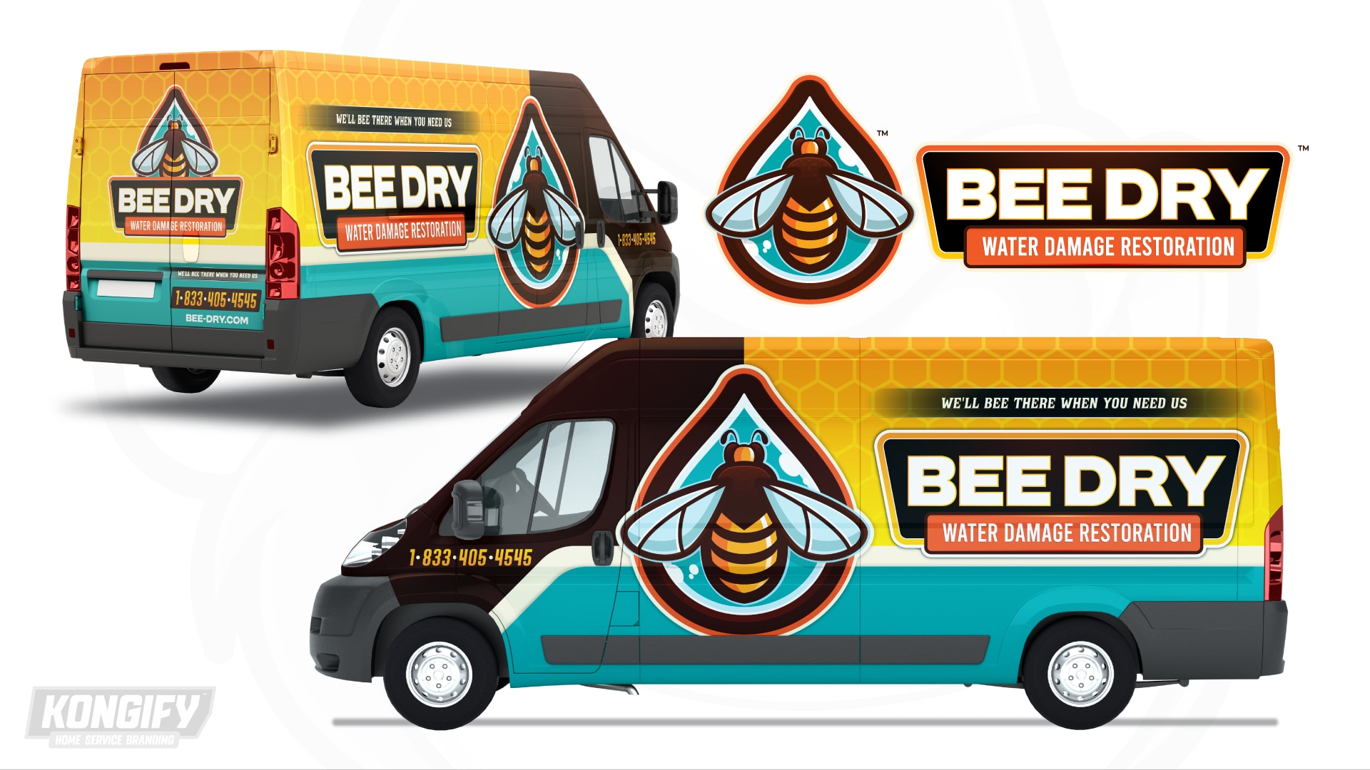
Bee Dry joins a bee and water drop in one symbol. Warm stripes contrast with the teal drop, while honeycomb details and curved bands extend that name-and-water connection across the van and polo.
The bee supplies a direct picture for Bee, while the drop connects the identity to water. Their overlapping shapes form one compact symbol above the name. Water Damage Restoration stays on its own orange panel beneath the larger letters.

The bee sits over a teal drop with its wings reaching past both sides. Warm body stripes stand apart from the cool center, joining two clear shapes without hiding either one.
Pale Bee Dry letters fill a dark-brown badge below the symbol. The orange service panel repeats the bee’s warm accents, linking the long descriptor to the illustration above.

The van separates the large bee-and-drop symbol from the name beside it. A yellow honeycomb field gives the upper body another connection to the bee theme.
A pale curved band rises near the dark front and divides the yellow area from teal below. Those broad fields repeat the symbol’s warm-and-cool contrast around the larger identity.

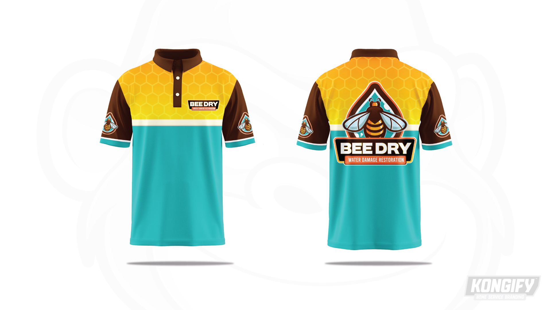
The shirt repeats yellow honeycomb above a pale band and a teal lower body. Brown sleeves and collar pick up the logo’s dark framing color.
The small chest badge uses just the name area. The back gives the full bee, drop and lettering more room, with smaller sleeve symbols keeping the illustration visible from the sides.
Explore the design work shown for this brand.
Source: The designs shown on this page.
Meet the Kongify team