Project details
The team behind the design
Explore the design work shown for this brand.
- Brand
- Bin Maids
- Work shown
- Logo Design, Truck Wrap Design, Uniform Design
- Design team
- Kongify
Source: The designs shown on this page.
Meet the Kongify team
The Bin Maids concept turns both words into pictures: a cleaning character and a bin within the lettering. Pastel tiles and sparkles connect the playful name to its applications.
The maid character explains one part of the name through clothing and tools. A wheeled bin replaces the i in Bin, giving the badge its own visual connection to garbage can cleaning.
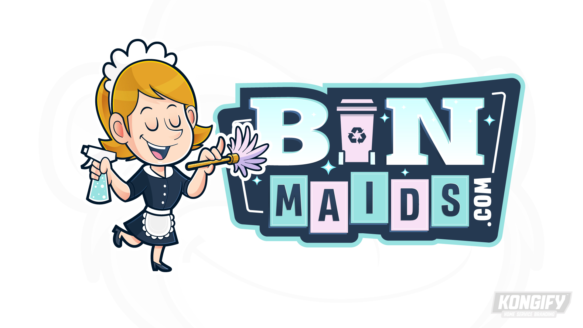
A spray bottle, duster, apron, and headpiece give the smiling character a cleaning role. Its lifted foot adds a light, playful pose beside the heavier badge.
A pink wheeled bin sits between the large B and N. Alternating aqua and pink Maids tiles repeat its color, while small sparkles join the character and lettering against navy.
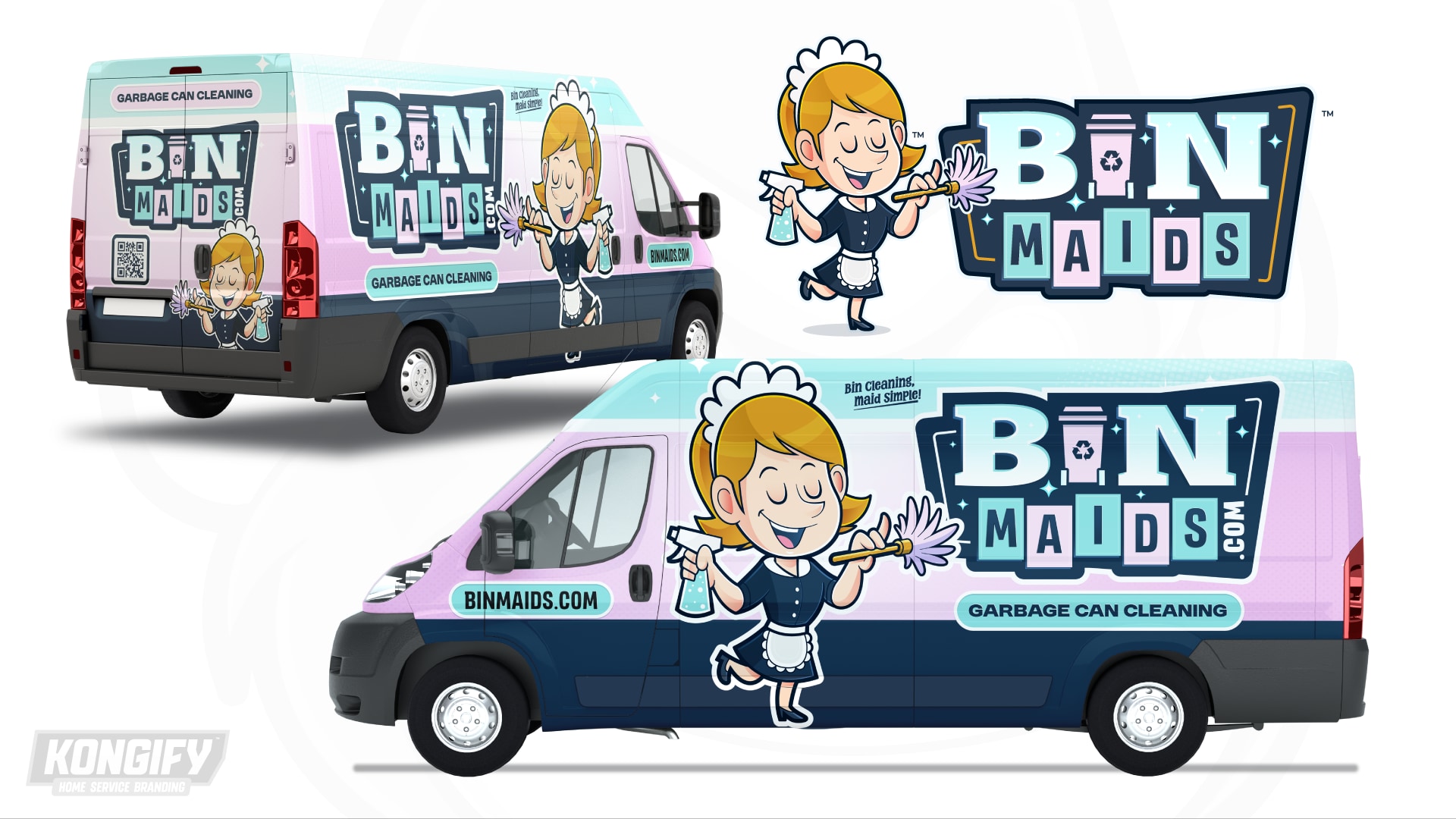
The broad pastel side gives the character and large badge room beside each other. A Garbage Can Cleaning panel beneath the name explains the intended service beyond the wordplay.
Aqua and pink fields repeat the letter tiles, with navy along the lower body. The rear brings the character and badge into a taller arrangement within those same colors.
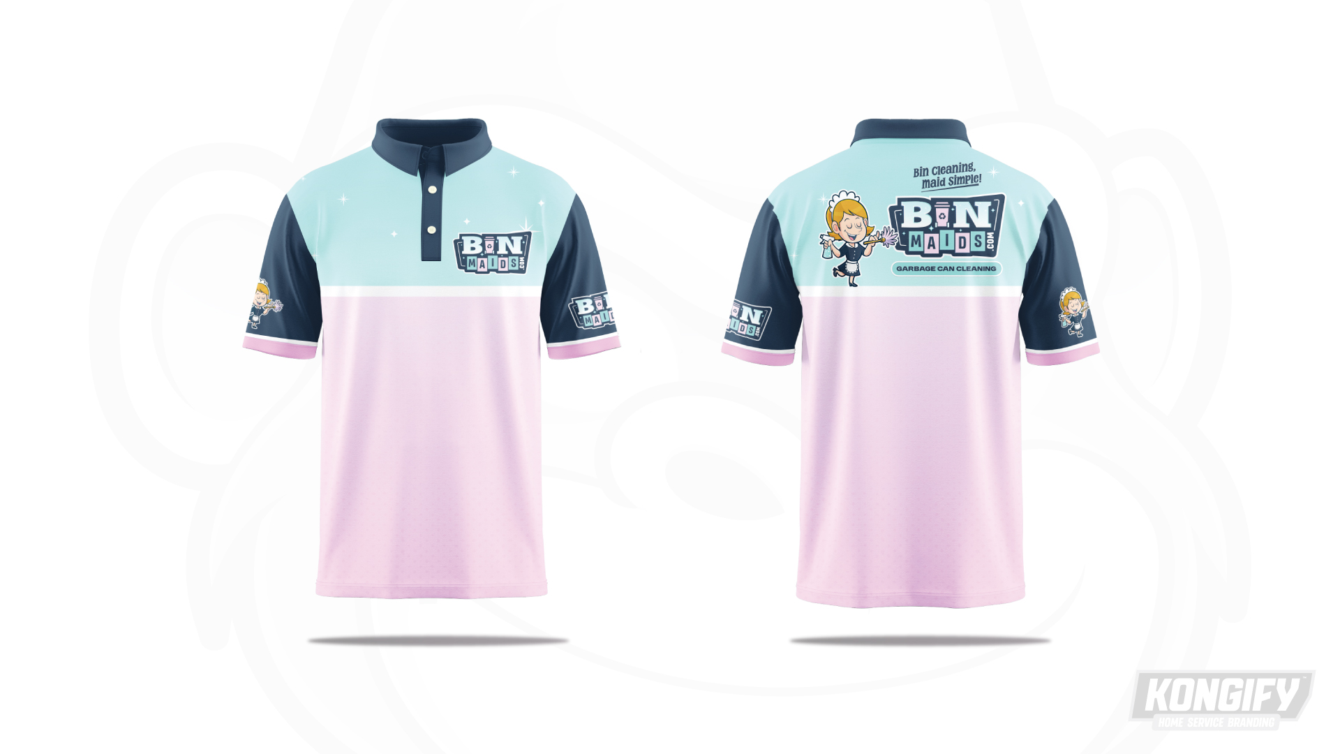
Aqua shoulders meet a pale pink body through a light band. Navy sleeves and collar frame these softer fields, echoing the dark border around the name.
The front uses a small badge. On the back, the character and lettering sit together above the separate service label, preserving the van concept’s main grouping at a smaller scale.
Explore the design work shown for this brand.
Source: The designs shown on this page.
Meet the Kongify team