Project details
The team behind the design
Explore the design work shown for this brand.
- Brand
- Blue Anchor Restoration
- Work shown
- Logo Design, Truck Wrap Design
- Design team
- Kongify
Source: The designs shown on this page.
Meet the Kongify team
Blue Anchor joins a blue anchor to a large B. The curved anchor arms pass around the initial, making both the named object and the first letter part of one symbol.
The anchor passes through the B and curves around its lower edge. Cream separates the letter from the blue object, while matching outlines unite the two. The full name repeats that contrast beside the emblem.
The logo uses Restoration as its service line. The van artwork uses Water Restoration beneath the same Blue Anchor name.
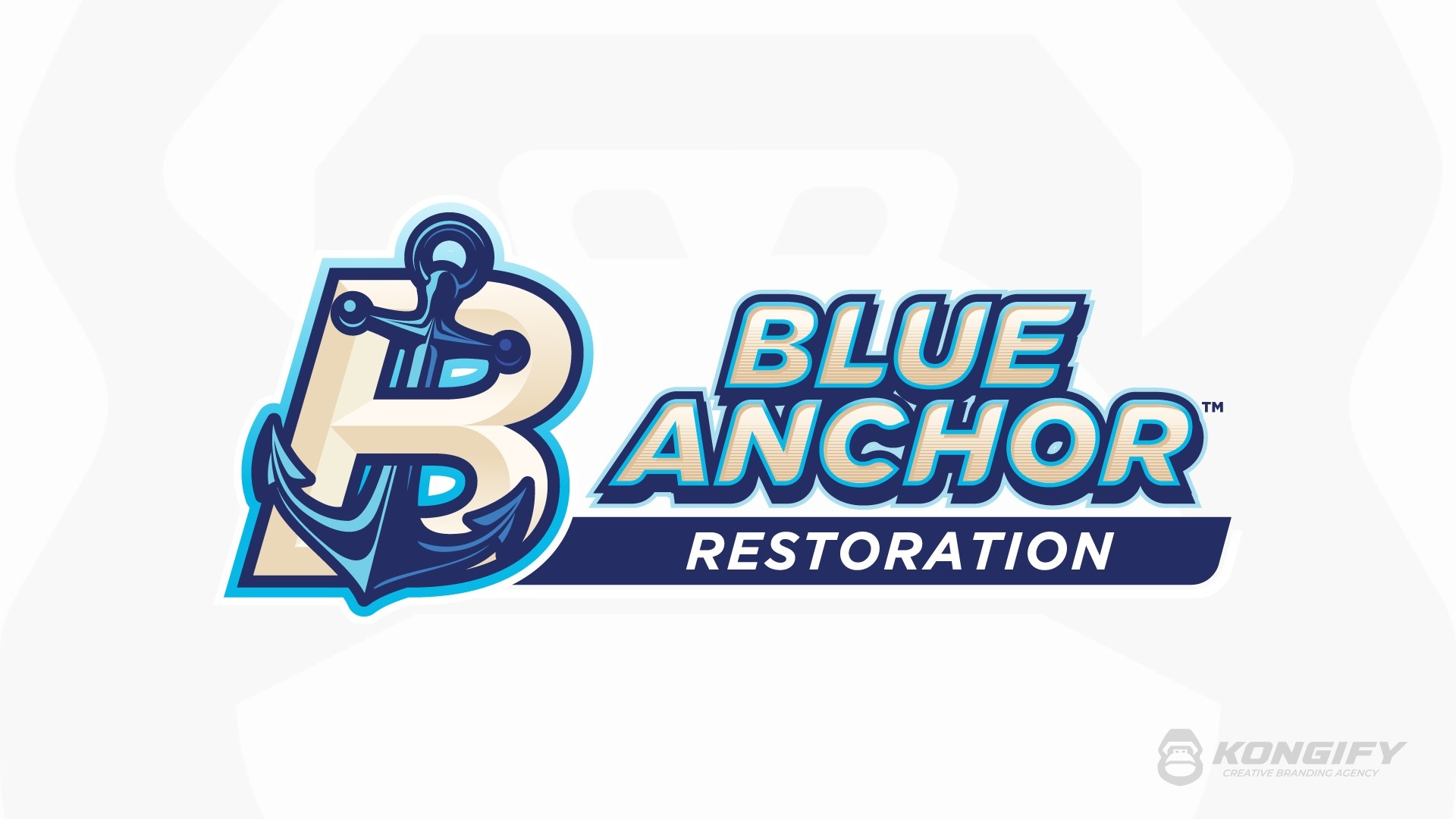
The cream B sits behind the blue anchor. Their crossing shapes share a navy and bright blue border, keeping the combined symbol defined without losing the letter’s outline.
The stacked Blue Anchor lettering repeats those pale fills and blue edges. A plain navy Restoration band gives the smaller service wording its own space below.
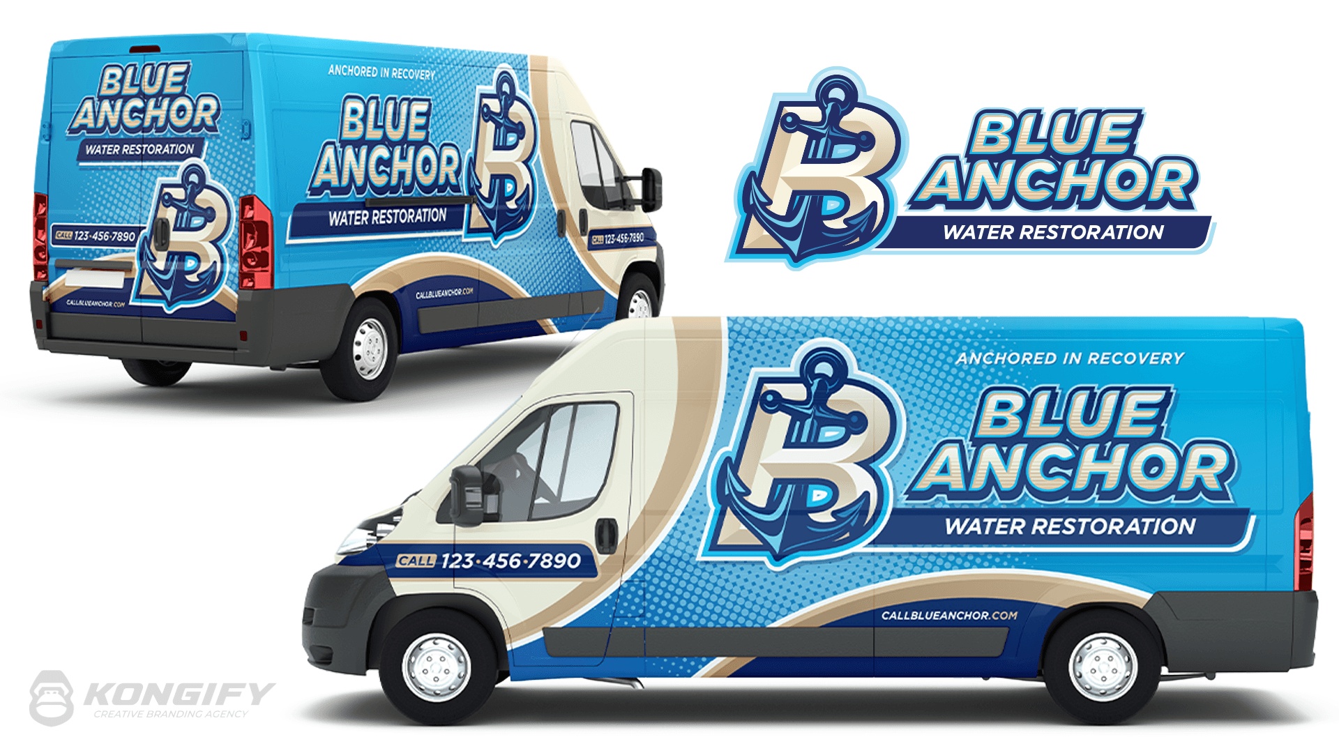
The B and anchor fill the area behind the cab, with a pale outline separating them from the bright blue side. The full name has a wider, less detailed area beside the symbol.
Cream and gold curves divide the blue field from the front and lower body. Those lighter shapes repeat the B’s color, connecting the wrap layout to the main emblem.
Explore the design work shown for this brand.
Source: The designs shown on this page.
Meet the Kongify team