Project details
The team behind the design
Explore the design work shown for this brand.
- Brand
- Chicagoland Water Medics
- Work shown
- Logo Design, Truck Wrap Design
- Design team
- Kongify
Source: The designs shown on this page.
Meet the Kongify team
Chicagoland Water Medics combines its first letter with a white cross. The compact symbol connects the Medics wording to a visual cue of help, while red and teal separate the name’s two lines.
The white cross fills the open part of the red C. This joins the first letter to the help-related idea in Water Medics. The name uses two clear rows, with a contrasting band beneath Chicagoland.
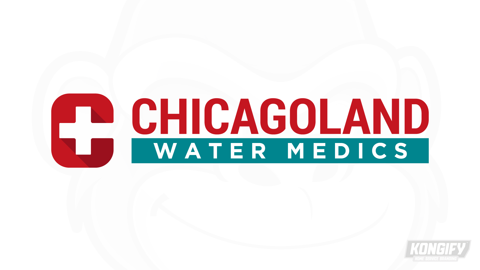
The red C wraps around the white cross, creating one compact mark with an open right edge. Darker red shadows add depth while leaving the outer shape simple.
Chicagoland repeats the red beside the symbol. White Water Medics lettering sits on teal below, giving both parts of the name distinct fields.
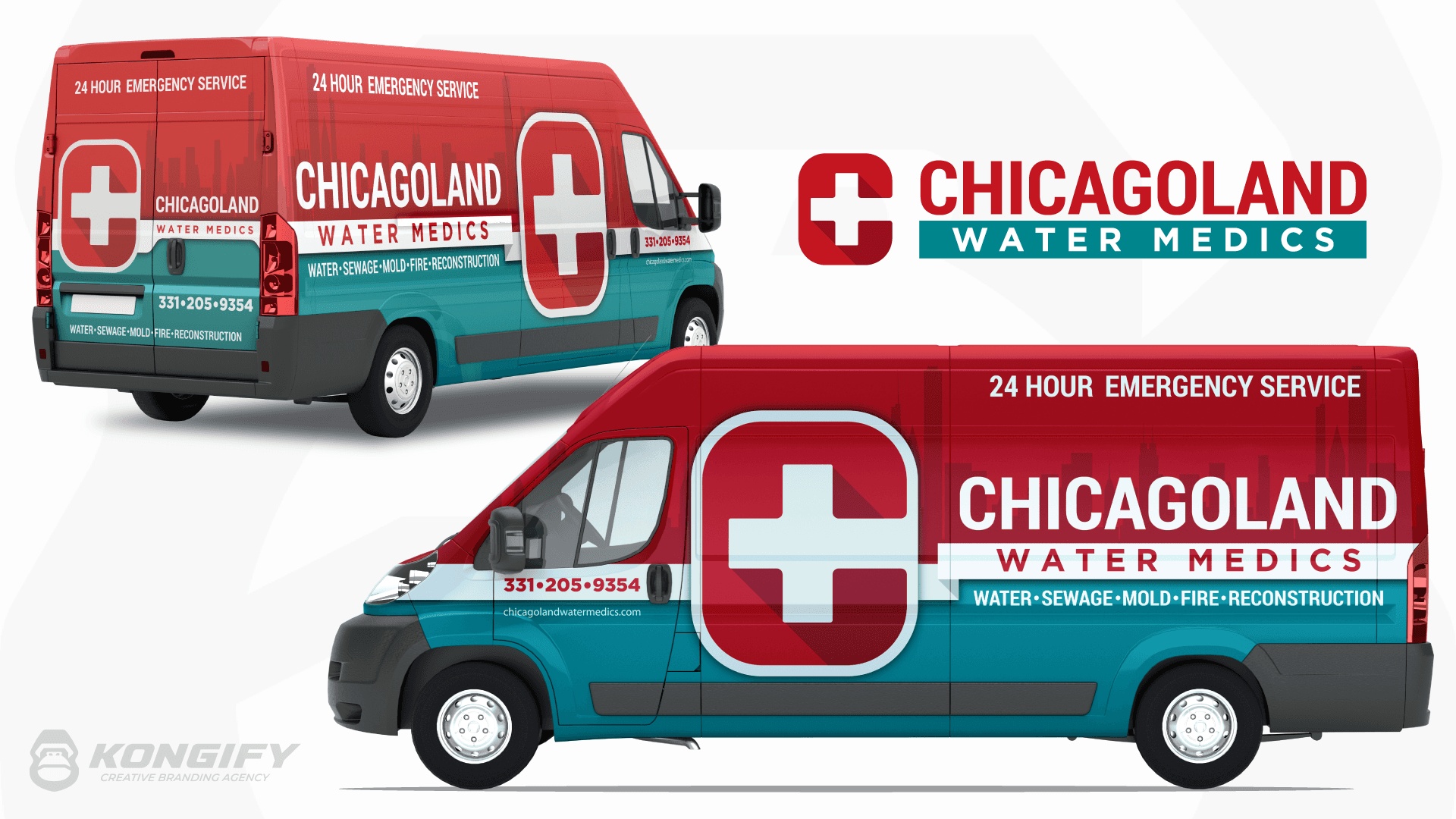
The enlarged C-and-cross mark spans the red upper van and teal lower body. Its pale outline keeps the shape separate from both fields.
The name sits in light lettering toward the rear, with a faint skyline behind it. White bands organize the smaller wording beneath the main name, preserving the logo’s clear rows at a larger scale.
Explore the design work shown for this brand.
Source: The designs shown on this page.
Meet the Kongify team