Project details
The team behind the design
Explore the design work shown for this brand.
- Brand
- Dew-Point
- Work shown
- Logo Design, Truck Wrap Design
- Design team
- Kongify
Source: The designs shown on this page.
Meet the Kongify team
Dew-Point combines the letters D and P around a blue drop. The pointed symbol gives the name a compact form, while orange and green expand from the initials into the van’s large color fields.
The water drop connects dew to a visible shape. The orange D and green P surround it, creating a compact symbol that can sit beside the wide name or stand larger on the van. Water, Fire, Mold remains a separate service line.
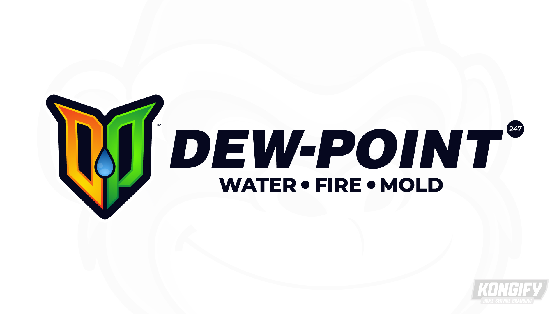
An orange D and green P form the two sides of a pointed mark. Dark outlines separate the letter shapes and frame the blue drop at their center.
The heavier Dew-Point lettering leans forward beside the symbol. The smaller service line sits directly below the name, keeping the full wording together while the initials work as a separate graphic.
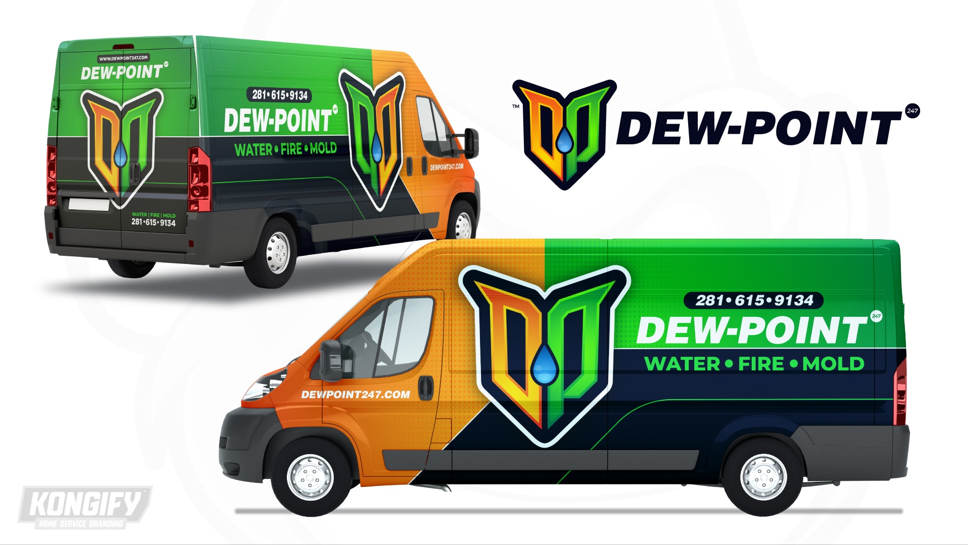
The van places orange at the front, green across the upper rear and dark blue below. The enlarged initials cross those divisions, with a pale border keeping their shape distinct.
The light name sits on green above the service line. On the rear, the symbol takes the larger central area beneath the name, showing how it can carry more of the composition in a narrower space.
Explore the design work shown for this brand.
Source: The designs shown on this page.
Meet the Kongify team