Project details
The team behind the design
Explore the design work shown for this brand.
- Brand
- Fastora Emergency Services
- Work shown
- Logo Design, Truck Wrap Design
- Design team
- Kongify
Source: The designs shown on this page.
Meet the Kongify team
Fastora pairs a layered F with lettering that leans at the same angle. Orange, yellow and teal distinguish the symbol’s bands, which grow into larger stripes across the van design.
The F and Fastora name share a forward lean. Rounded corners soften the symbol, while darker overlaps give the colored bands depth. Emergency Services sits in a separate warm-colored line beneath the name.
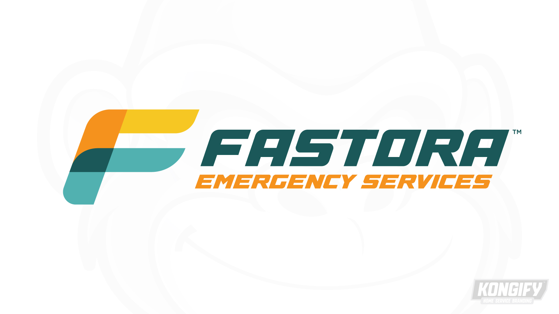
Orange and yellow make up the upper part of the F, while teal carries its lower shape. A dark overlap shows where the bands meet, giving the simple initial a layered appearance.
Fastora uses a matching slant in darker teal. The smaller orange service line repeats the warm part of the symbol, connecting both rows of wording to the mark.
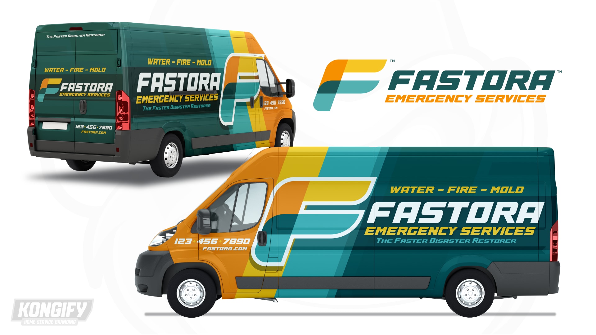
The wrap enlarges the F beside the cab, where orange, yellow and teal stripes cross the vehicle’s height. A pale border separates the symbol from those matching fields.
The lighter Fastora name sits farther back against dark teal. Smaller wording forms rows above and below it, leaving the larger initial and its stripes as the main graphic at the front.
Explore the design work shown for this brand.
Source: The designs shown on this page.
Meet the Kongify team