Painting Branding Portfolio

Peanut Butter Painting Home Service Branding

Peanut Butter Painting turns a slice of bread into a painter. Food colors, a brush and a checked stripe connect the playful name to the trade.

A food name with a painting role

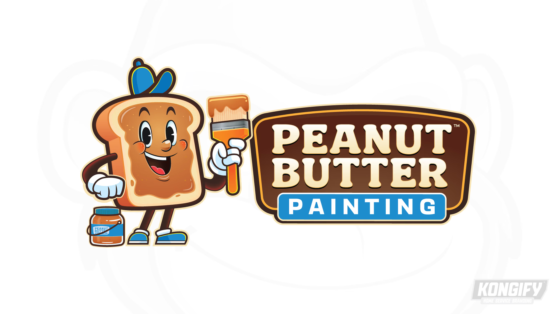
Peanut butter on bread makes the name visual. Adding a brush and a handled jar gives the character a painting role. The blue service plate makes that connection explicit beneath the name.

Peanut Butter Painting logo with a smiling bread mascot holding a paintbrush.

The brush gives the bread a job

The smiling bread character holds a brush beside a jar with a pail handle. These tools bridge the food-based name and the painting service.

Cream letters stand out inside a brown badge. Blue in the “Painting” plate returns in the cap and shoes, linking the lettering to the character.

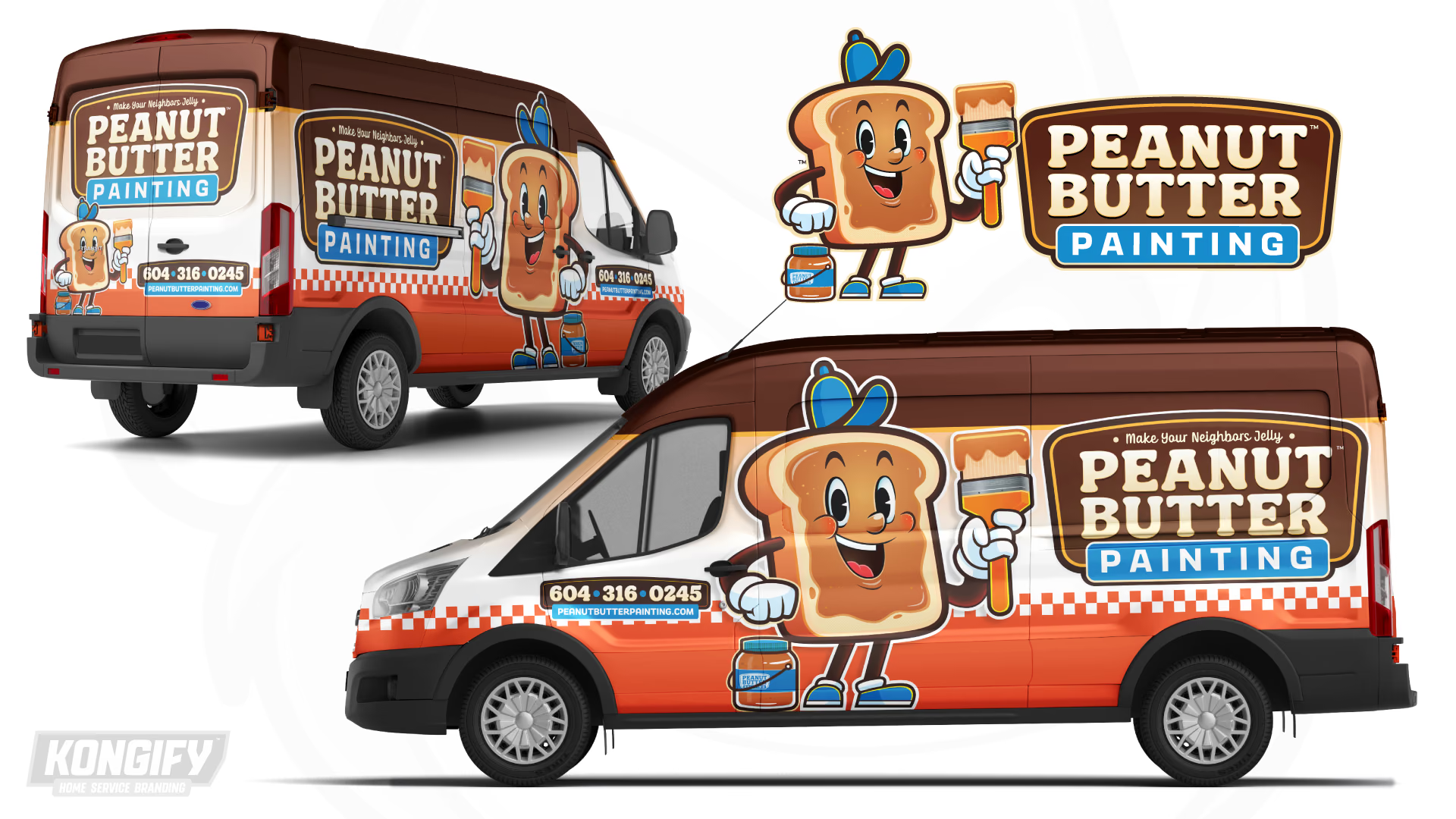
Peanut Butter Painting van wrap design in brown, cream, orange, and blue.

Broad bands give the mascot room

The van separates brown, cream and orange into wide bands. The large bread character crosses those bands, bringing the full height of the side into the composition.

The name sits against the cream area, separate from the contact details near the cab. A checked stripe runs between the lighter center and orange base, giving both side and rear a shared dividing line.

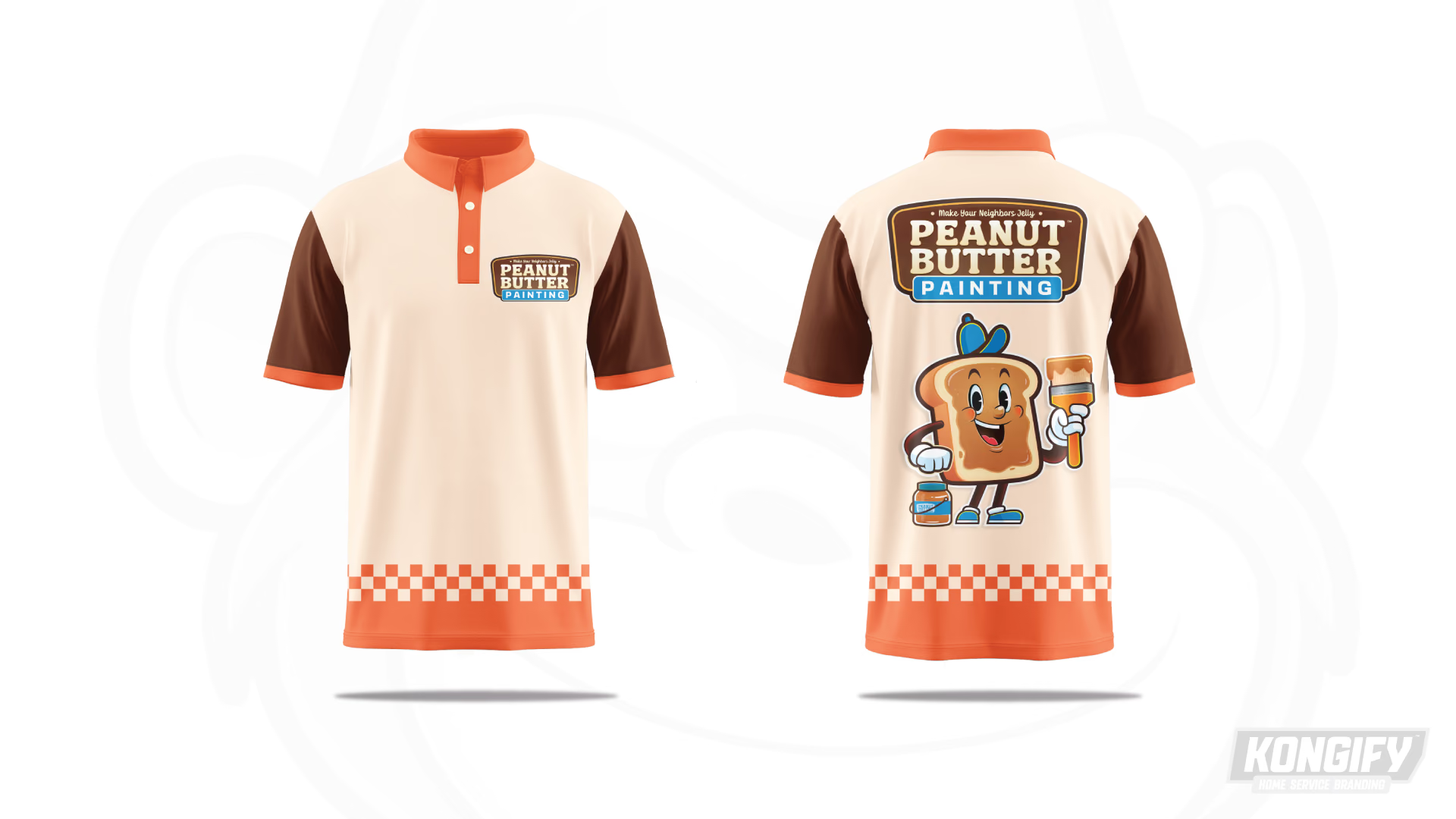
Front and back of the Peanut Butter Painting polo design with orange checkerboard trim.

A simple front and a full character on the back

The small chest badge leaves the cream front mostly open. Brown sleeves frame that light field, while orange trim links the collar, cuffs and hem.

The back stacks the name above the bread character. The checked band stays near the hem, carrying the van’s pattern onto the shirt without crowding the main artwork.

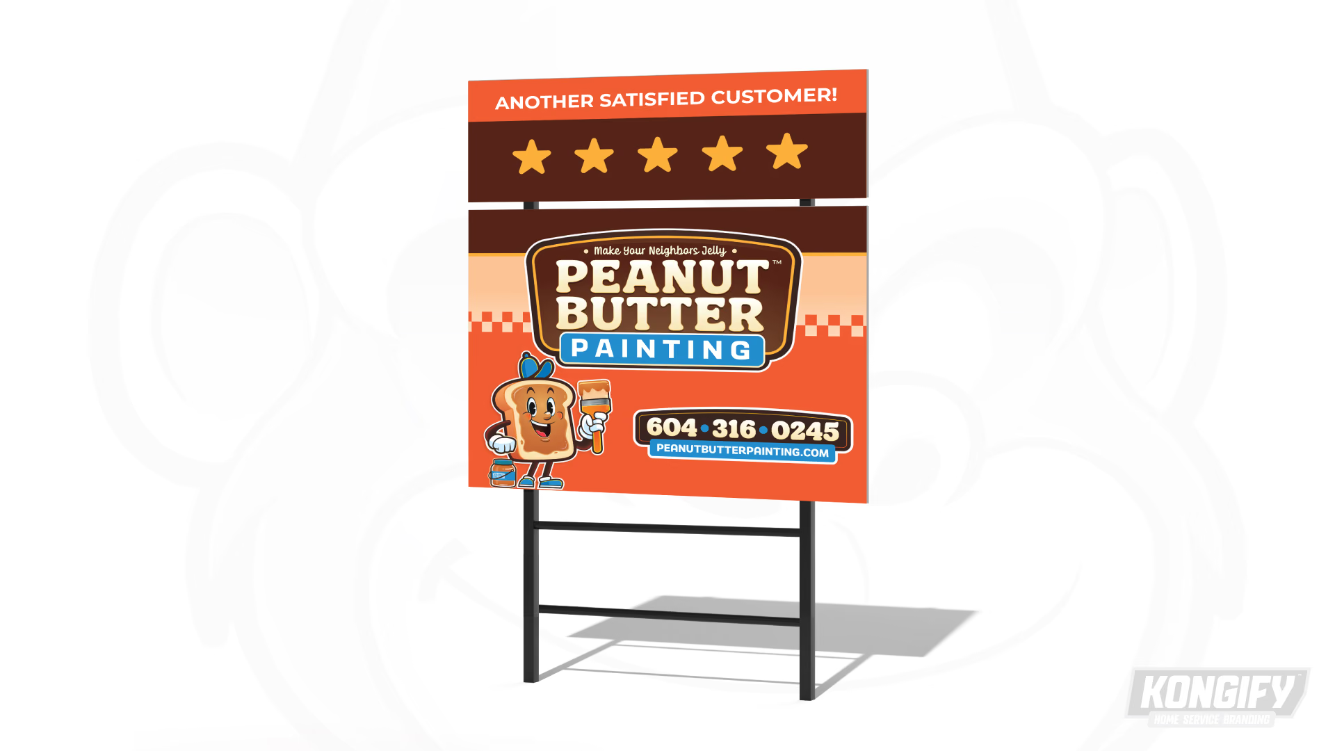
Peanut Butter Painting yard-sign design mockup with the logo, mascot, and contact details.

The sign gives the name the upper half

The large badge fills the top of the main sign panel. Below it, the bread character stands beside the contact block, balancing a picture on one side with words on the other.

Cream and orange divide those two areas. The checked stripe marks the change, while blue connects the service plate to the smaller website strip.

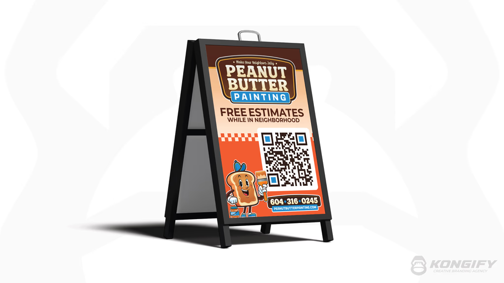
Peanut Butter Painting A-frame sign artwork.

The character accompanies the contact step

The A-frame uses its height to stack the name, message and QR-code area. The checked stripe divides the lighter upper field from orange below.

The bread character stands beside the code, keeping its painting tools close to the next step. Brown lettering above and pale contact details below each contrast with their background.

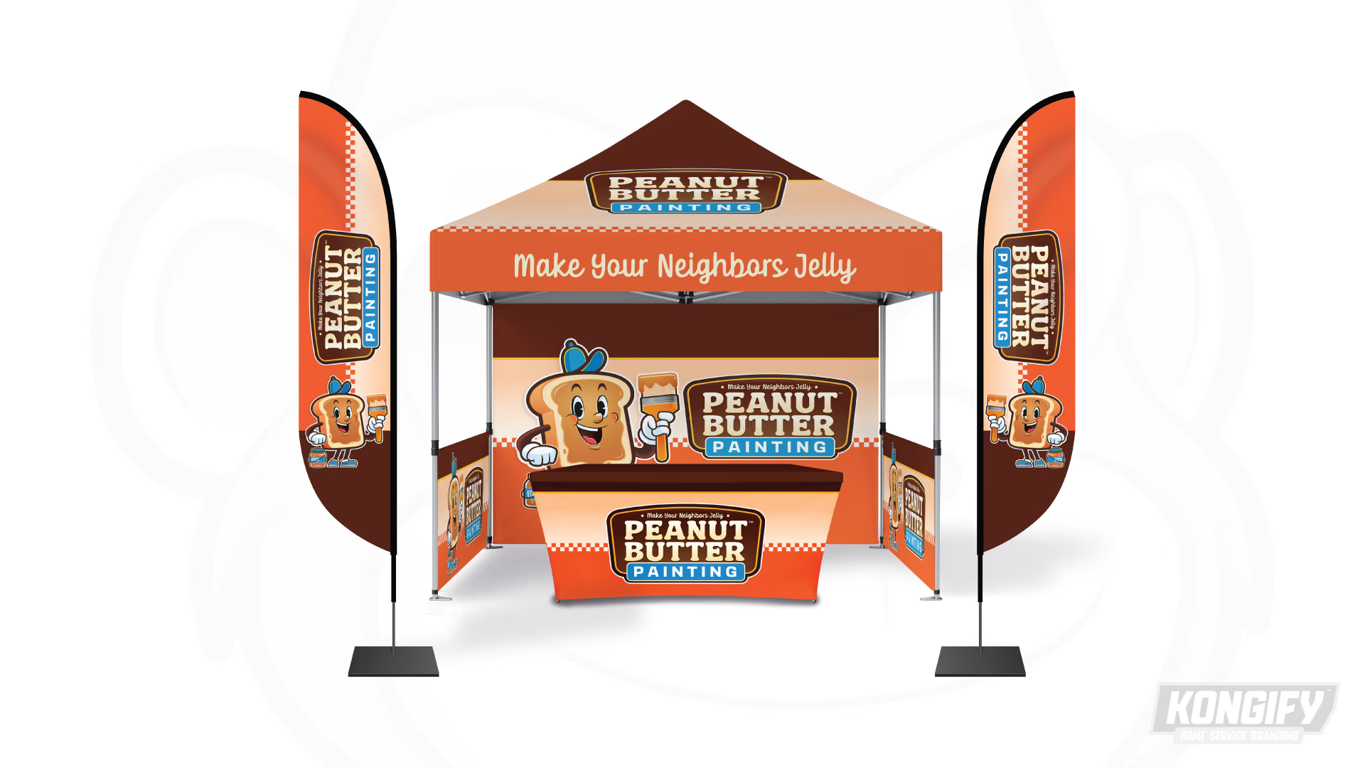
Peanut Butter Painting canopy, flags, backdrop, and table-cover design.

Food wordplay above a matching display

“Make Your Neighbors Jelly” stretches across the canopy edge. It extends the food theme from Peanut Butter into the supporting message.

The backdrop places the bread character beside the name, while the table cover lets the badge lead alone. Checked stripes connect those wide pieces to the narrow flags, giving the display a repeated detail beyond its colors.

The team behind the design

Explore the design work shown for this brand.

Brand
Peanut Butter Painting
Work shown
Logo Design, Truck Wrap Design, Uniform Design, Yard Sign Design, A-Frame Design, Trade Show Design
Design team
Kongify

Source: The designs shown on this page.

Meet the Kongify team