Project details
The team behind the design
Explore the design work shown for this brand.
- Brand
- Phoenix Restoration Water, Fire, and Mold
- Work shown
- Logo Design
- Design team
- Kongify
Source: The designs shown on this page.
Meet the Kongify team
Phoenix Restoration joins a flame-shaped bird to water and fire details inside the name. Orange, brown, and aqua connect the character to the restoration service wording.
The bird’s feather shapes rise into a flame-like point. A smaller flame dots the i and a water drop sits inside the O, repeating the service themes within the name when it appears without the character.
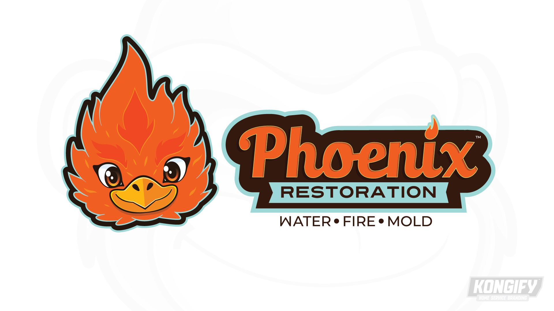
A yellow beak and wide eyes sit within the orange flame-shaped head. Layered feather edges connect the bird and fire ideas without needing a separate background scene.
Orange Phoenix lettering stands on dark brown. An aqua Restoration panel separates it from the Water, Fire, and Mold line below, giving the longer identity three clear levels.
Explore the design work shown for this brand.
Source: The designs shown on this page.
Meet the Kongify team