Project details
Explore the design work shown for this brand.
- Brand
- Pure Aid Water Damage Restoration
- Work shown
- Logo Design, Truck Wrap Design
- Design team
- Kongify
Source: The designs shown on this page.
Meet the Kongify team
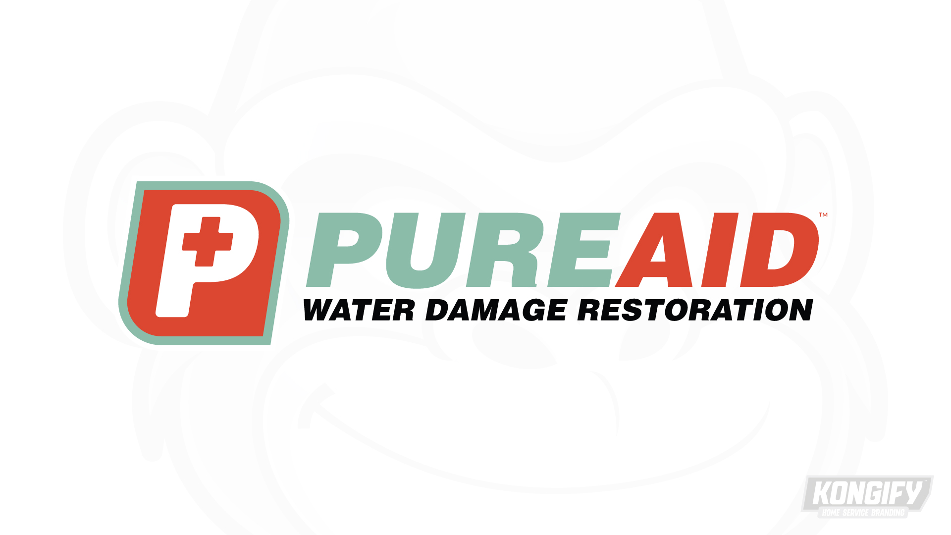
Pure Aid places a cross inside its first letter. The white P, red-orange tile and sage border connect to the two colors in the name, with the restoration service stated plainly below.
The cross gives Aid a familiar visual cue, while the P connects the symbol to Pure. The name repeats the tile’s two main colors. A separate Water Damage Restoration line makes the actual service clear.

The white P stands on a red-orange tile, with a small cross inside its opening. A sage border follows the tile, giving the compact symbol a second color edge.
Pure uses sage and Aid repeats red-orange, connecting each word to the mark. The plain dark service line stays below, where the longer description can remain separate from the larger name.

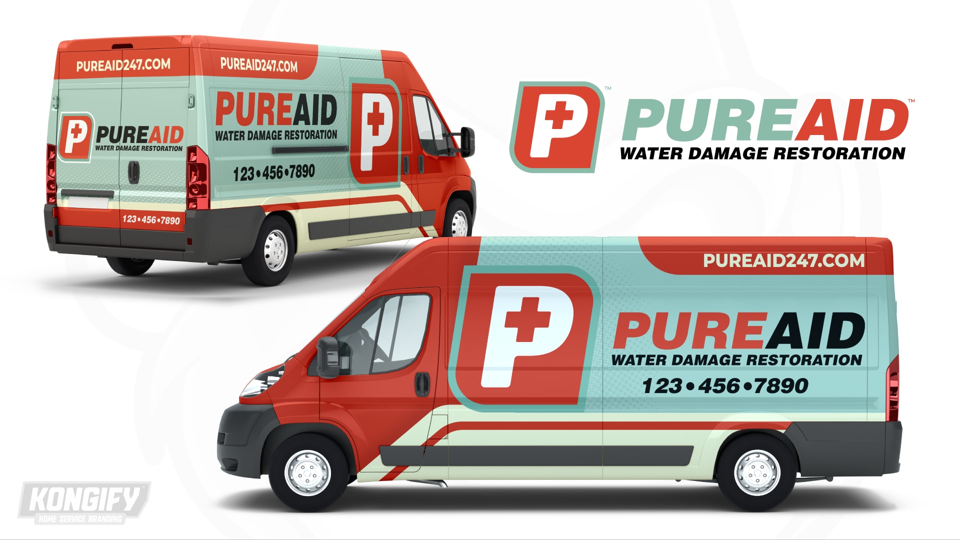
The enlarged P sits near the front against a red panel. The name occupies the pale green side beside it, with dark lettering used for contrast on the lighter background.
Red strips along the upper and lower body repeat the tile color. The rear keeps the symbol beside the name, retaining the same two-color connection.
Explore the design work shown for this brand.
Source: The designs shown on this page.
Meet the Kongify team