Environmental Services Branding Portfolio

Pure Matters Environmental Inspections & Consulting Home Service Branding

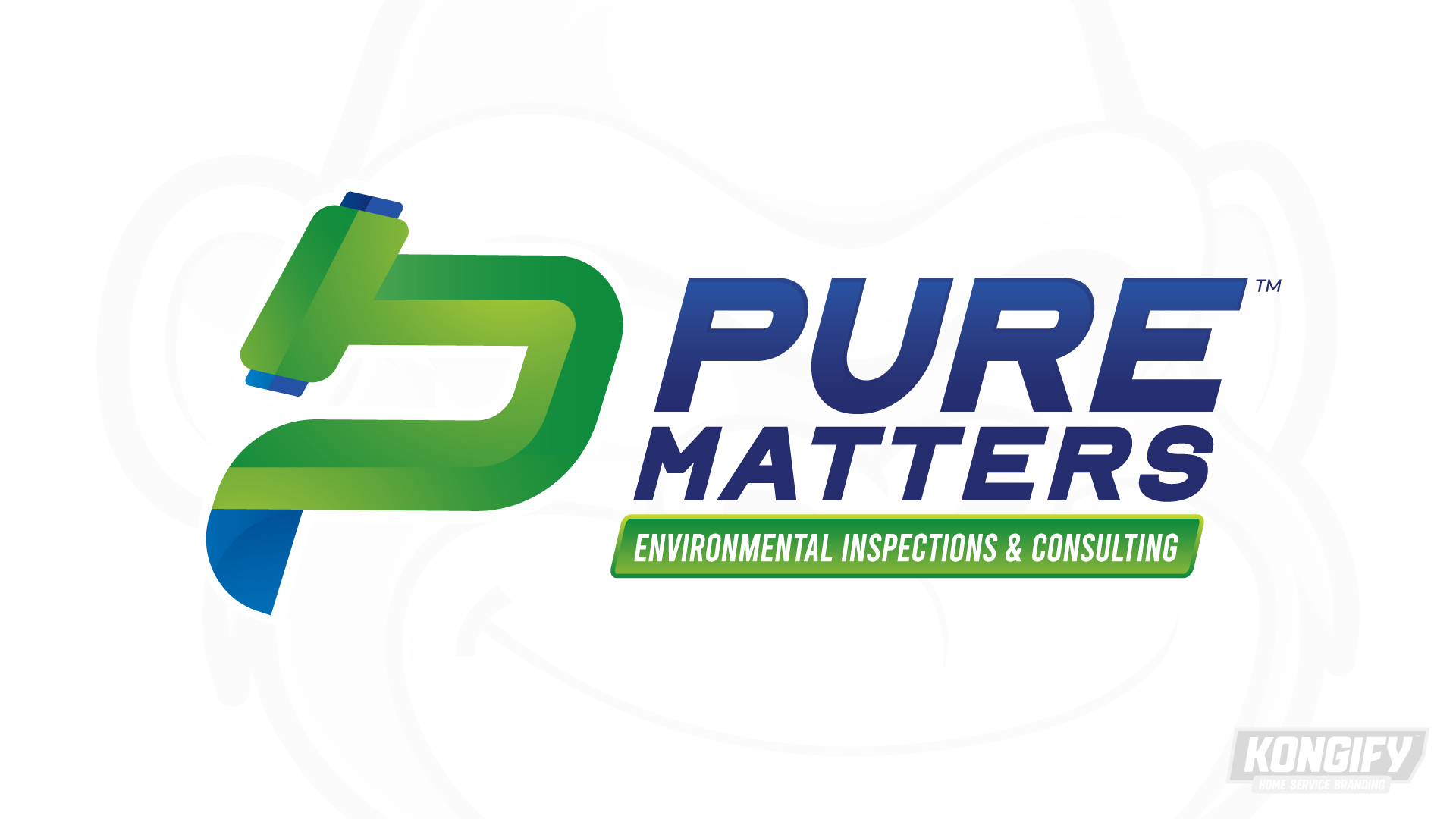
Pure Matters pairs a P-shaped, microscope-like symbol with a clear two-line name. The icon links an initial to inspection, while green bands separate the longer service wording from the main mark.

An initial with an inspection cue

The curved P-like body and tilted upper piece resemble a microscope. This gives the first letter a connection to close inspection. Environmental Inspections & Consulting states the work in full beneath the larger name.

Pure Matters logo with a green P-shaped symbol and Environmental Inspections & Consulting beneath the name.

The symbol combines a letter and an instrument cue

The green body curves around an open center, with a tilted piece across the upper left. Small blue ends define the instrument-like details while the overall shape still reads as a P.

Pure leads the stacked blue name, with Matters below. The green service band keeps the longer description together and repeats the icon’s main color.

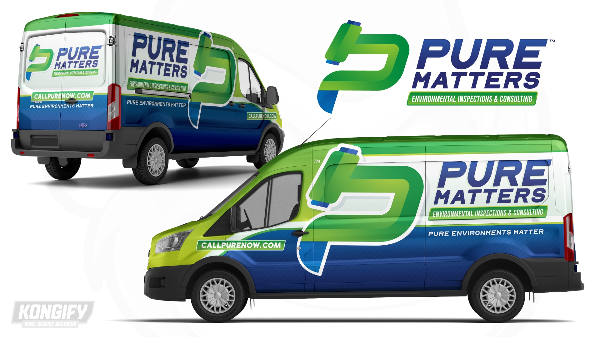
Pure Matters van-wrap design with a large green icon, blue name, and white side panel.

A white panel leaves the long name unobstructed

The large icon crosses from the green front toward the name on the van. Its pale outline defines it against the different background fields.

The name and service description sit on white above a blue lower panel. This plain area gives the longer wording room, while fine diagonal lines add texture below it.

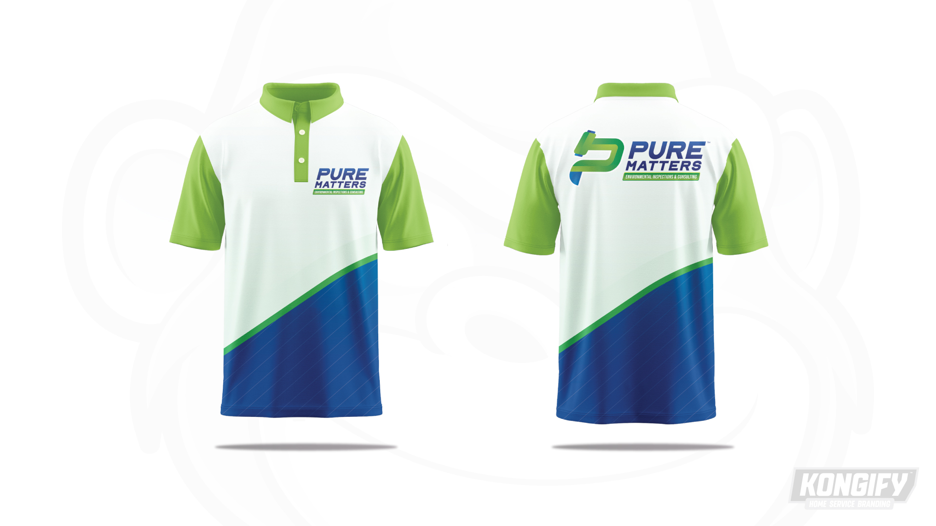
Front and back of the Pure Matters polo design in white, green, and blue.

The shirt repeats the open white field

The white upper shirt leaves a clear area around the compact chest logo. Green sleeves and collar repeat the icon’s main color, framing the lighter center.

A curved green edge divides white from the patterned blue base. The back uses a larger full mark above that divide, retaining the same symbol, name and service grouping.

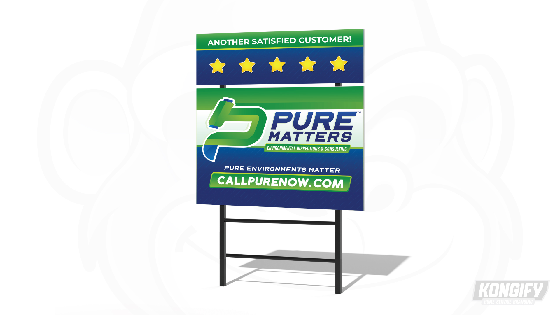
Pure Matters yard-sign design mockup with its green icon, blue lettering, and website panel.

A wide white band keeps the full identity together

The yard sign puts the icon, name and long service line across a white band. A green upper edge repeats the icon color without adding another illustration.

The supporting message and website sit below on blue. A green website panel separates the contact cue from the smaller line above it.

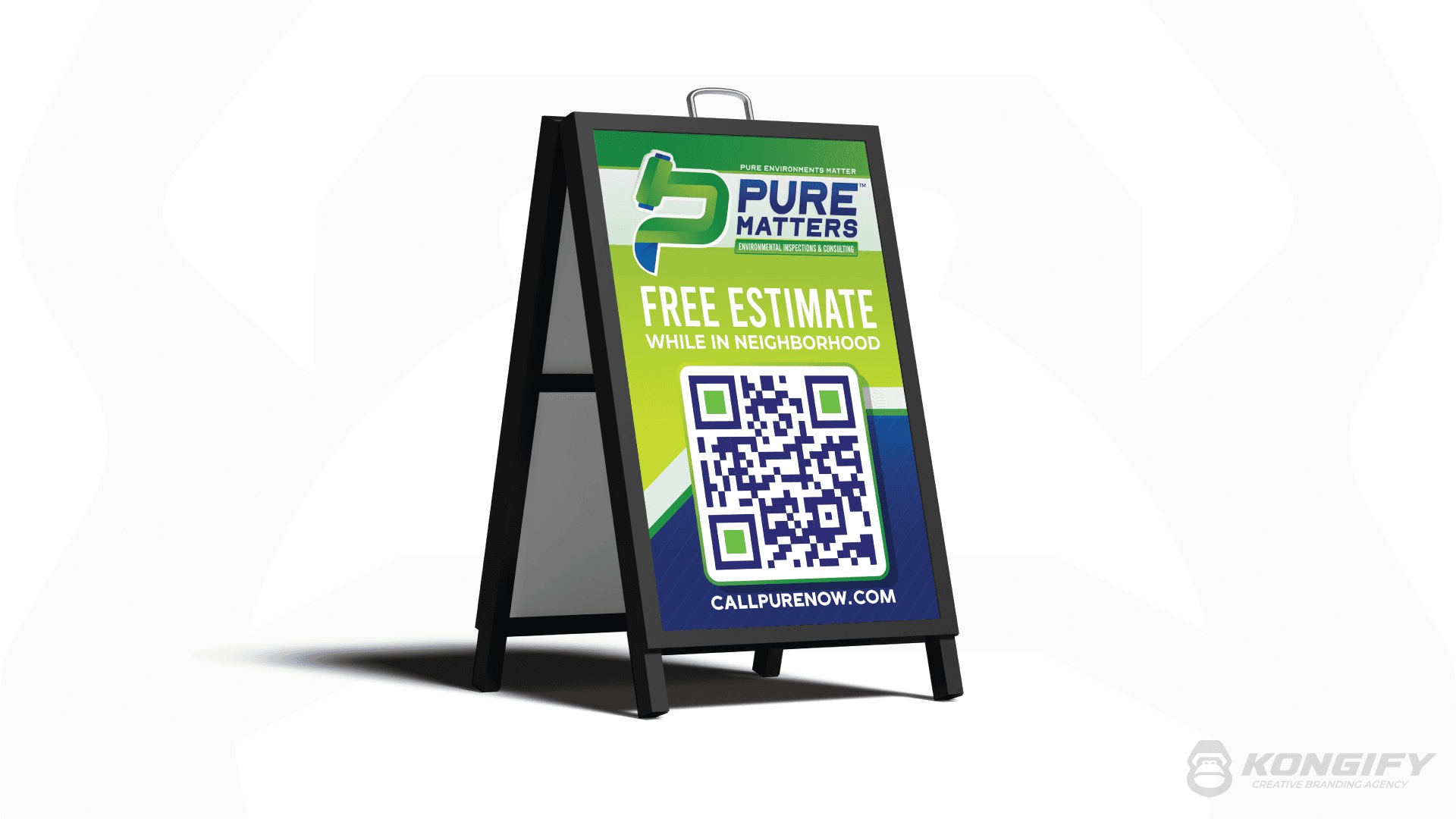
Pure Matters Environmental Inspections & Consulting A-frame sign artwork.

Large color fields organize the vertical sign

The A-frame keeps the full name and icon in a light upper panel. Green holds the central message, with blue around the QR code and website below.

The pale angled divide repeats the van’s curved separation at a smaller scale. It keeps the information groups distinct while carrying the same green, white and blue structure.

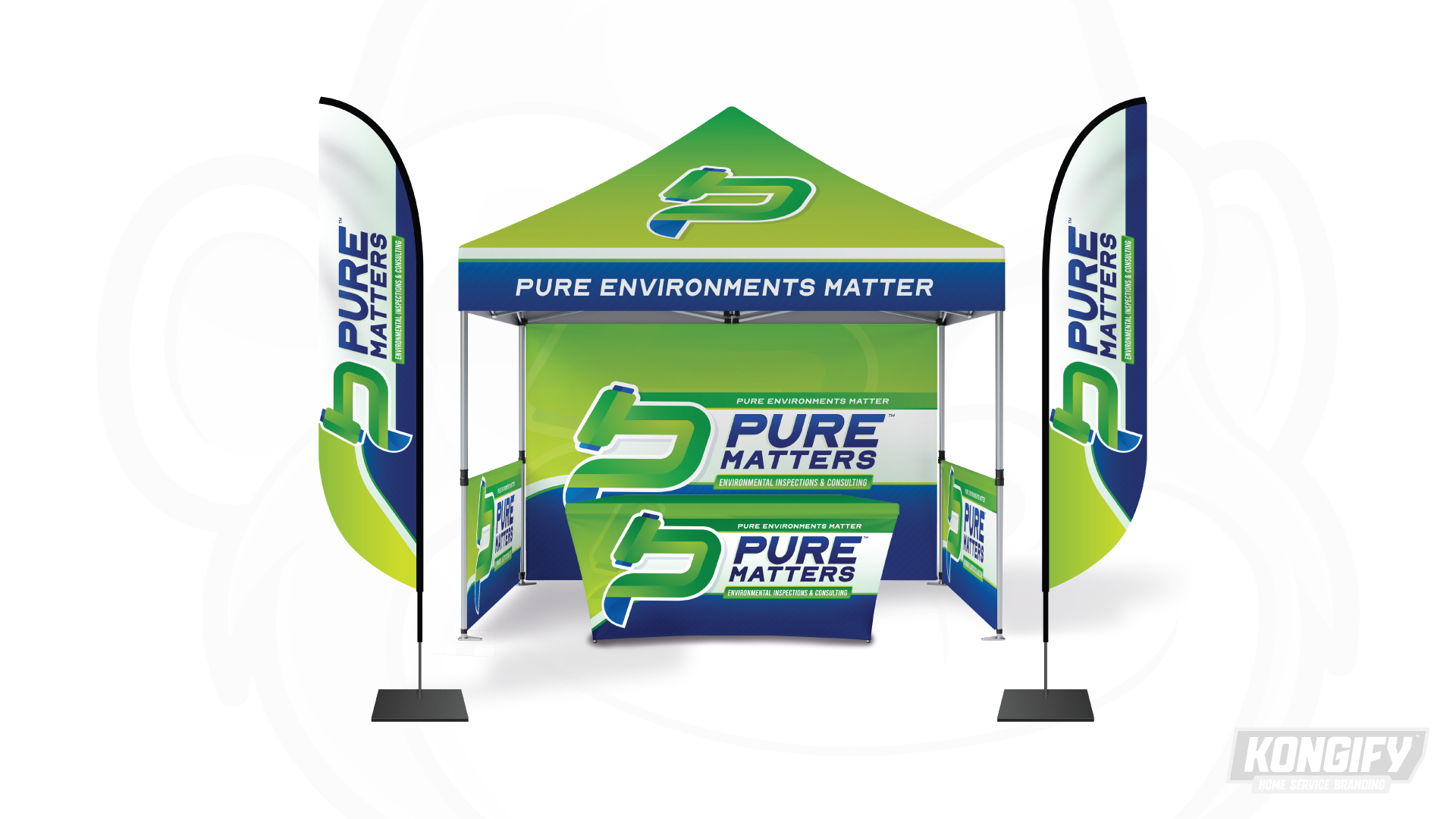
Pure Matters canopy, flags, backdrop, and table-cover design in green, blue, and white.

The icon has its own place above the display

The canopy roof uses the P-shaped symbol alone. The backdrop and table cover combine it with the full name across white panels, preserving room for the longer service line.

The flags turn the main lettering vertically, while green curves connect their narrow fields to the wider surfaces. The blue canopy edge gives the supporting message a separate band overhead.

The team behind the design

Explore the design work shown for this brand.

Brand
Pure Matters Environmental Inspections & Consulting
Work shown
Logo Design, Truck Wrap Design, Uniform Design, Yard Sign Design, A-Frame Design, Trade Show Design
Design team
Kongify

Source: The designs shown on this page.

Meet the Kongify team