Project details
The team behind the design
Explore the design work shown for this brand.
- Brand
- Remove Right
- Work shown
- Logo Design
- Design team
- Kongify
Source: The designs shown on this page.
Meet the Kongify team
Remove Right puts boards and a demolition tool into the name itself. A worker carrying timber, wood-grain letters, and green accents connect the illustration to removal work.
The carried boards establish the removal theme beside the worker. Wood grain and a jackhammer-shaped letter bring the same idea into the words, making the character and name explain one task.
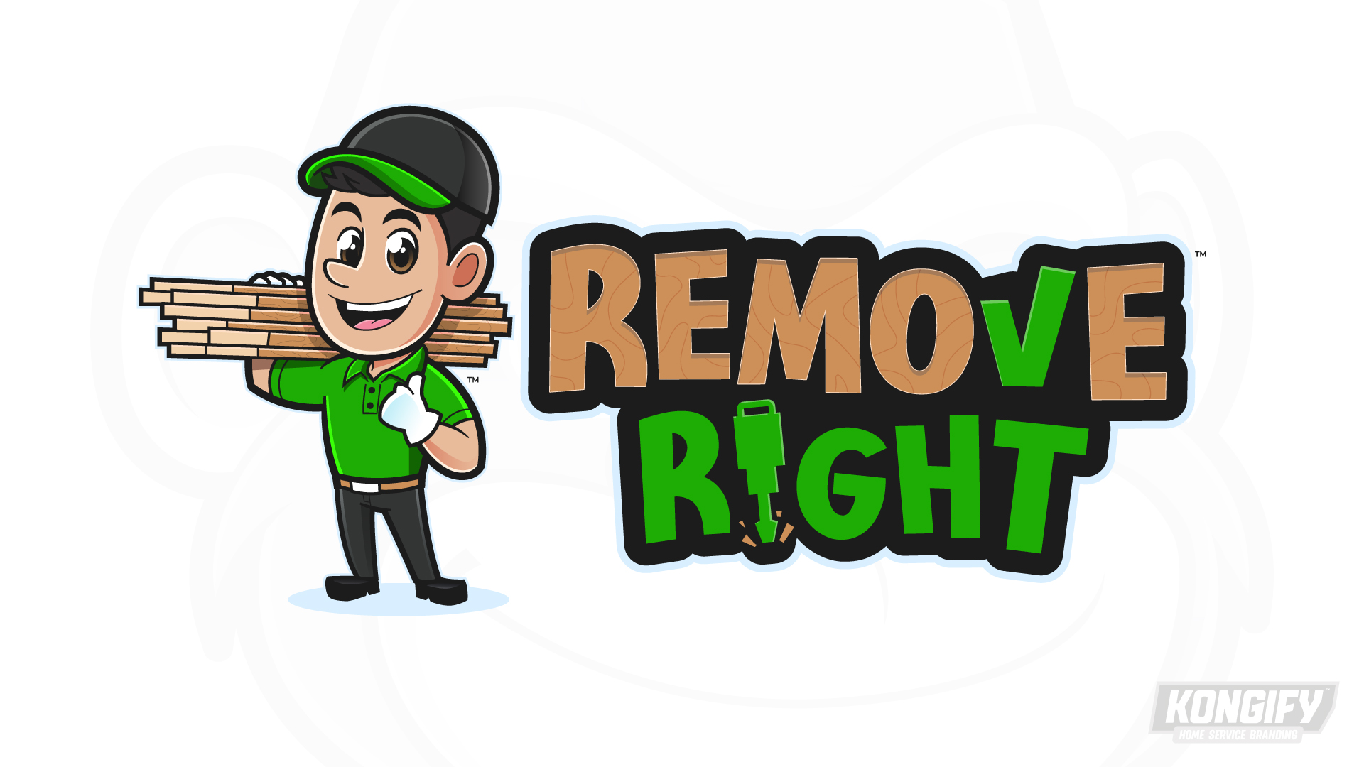
Wood-grain shapes fill most of Remove, echoing the boards on the worker’s shoulder. The green V becomes a check mark, linking the word to the green shirt and cap trim.
A jackhammer replaces the i in Right, with small debris marks beneath it. A dark outline joins the two name lines, while the worker’s thumbs-up adds a friendly gesture beside the tool-based lettering.
Explore the design work shown for this brand.
Source: The designs shown on this page.
Meet the Kongify team