Project details
Explore the design work shown for this brand.
- Brand
- Rocket Socket Electrical
- Work shown
- Logo Design, Truck Wrap Design, Uniform Design
- Design team
- Kongify
Source: The designs shown on this page.
Meet the Kongify team
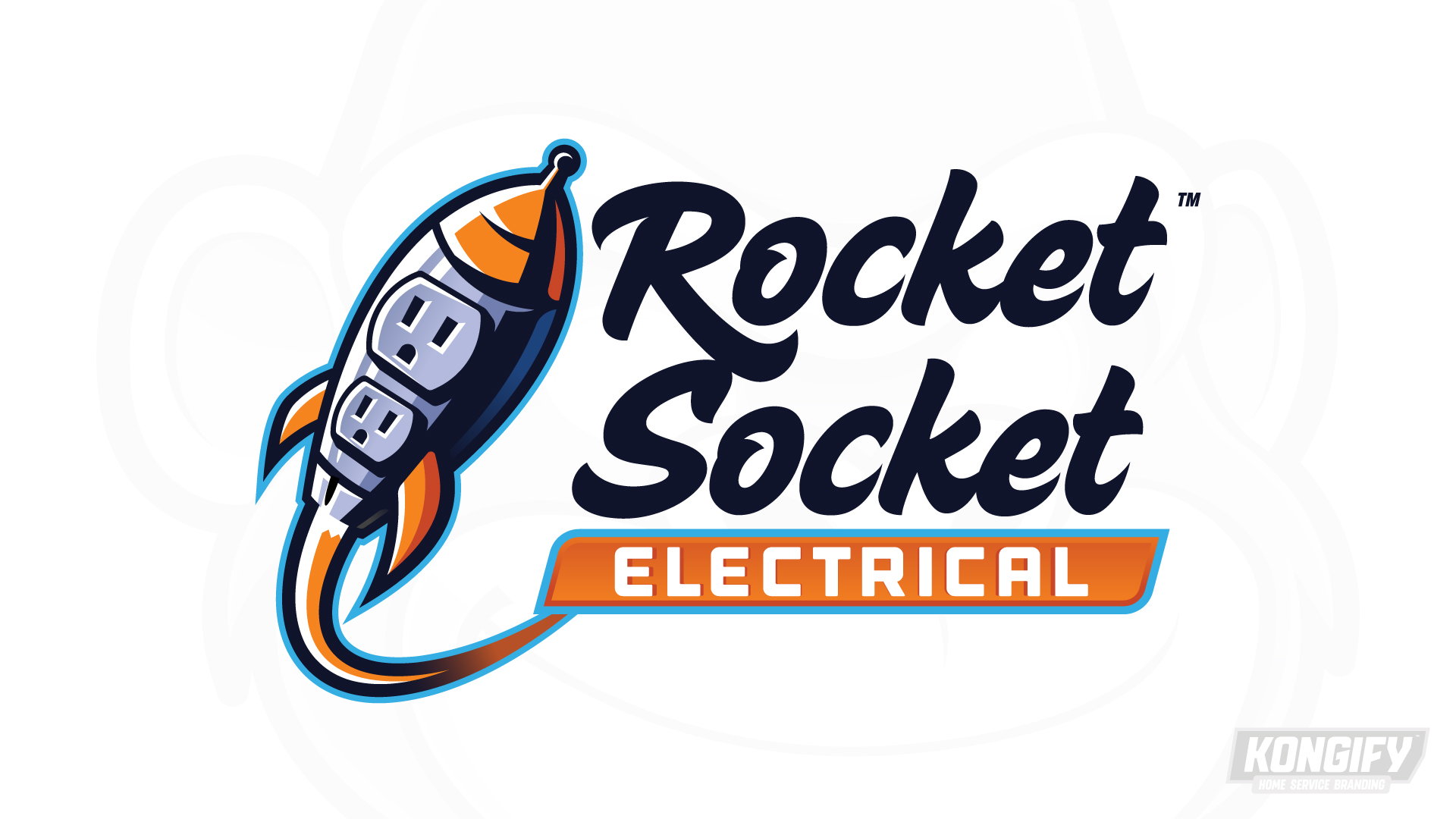
This Rocket Socket design concept makes both name words part of one icon. Electrical outlets form the rocket’s body, while a curved trail carries the space theme into the lettering and applications.
Two outlet faces turn a rocket into an electrical symbol. The rhyming name repeats those two ideas in words. A sweeping trail joins the illustration to the separate Electrical panel beneath the name.

The two sockets sit inside the tilted rocket body, with orange fins and a pointed nose surrounding them. This gives each part of the name a visible place in one drawing.
The curved trail leads beneath the stacked script lettering. It meets the orange Electrical strip, connecting the moving shape to the service description.

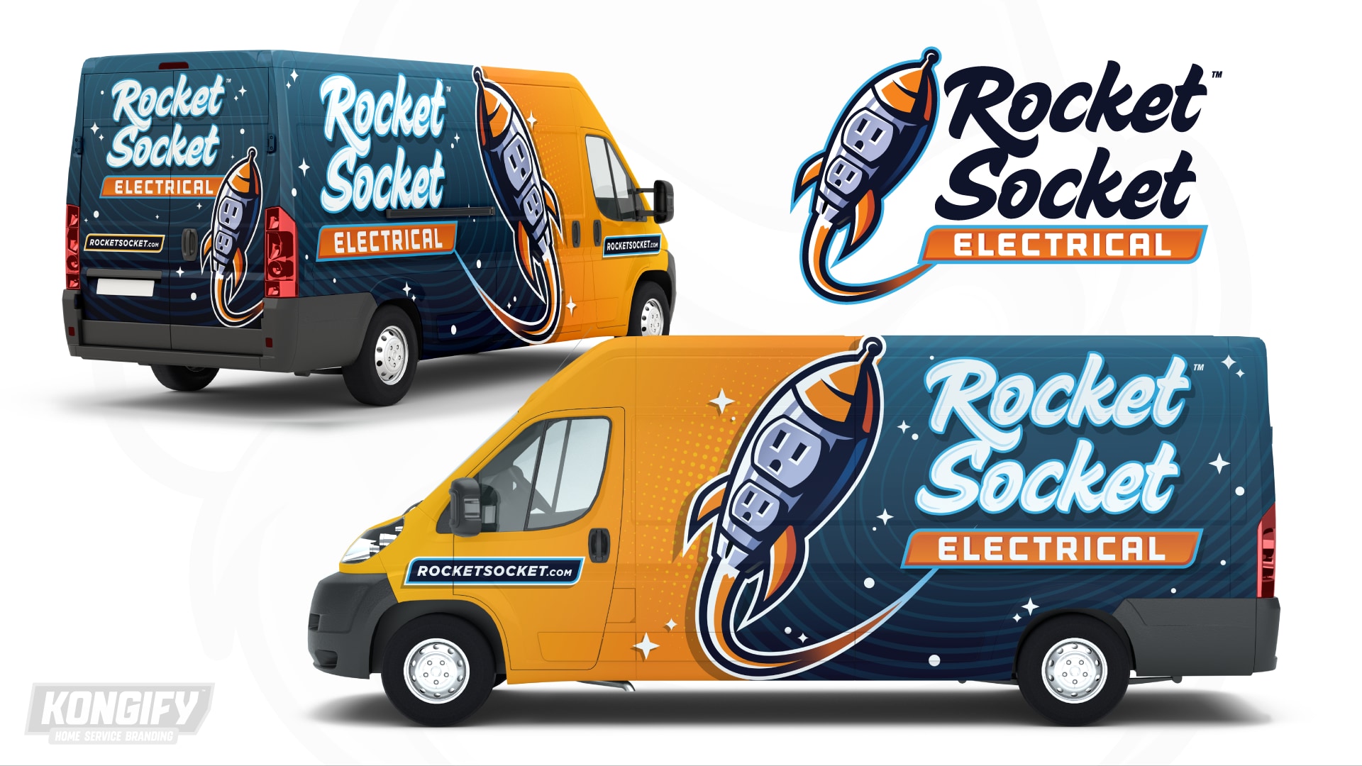
The large rocket crosses the border between an orange front and a dark blue rear. Its trail sweeps beneath the name, making the lettering part of the larger composition.
Stars and fine curved lines extend the space setting through the dark field. Pale lettering stands apart from those smaller details, while the website stays in a separate panel near the cab.

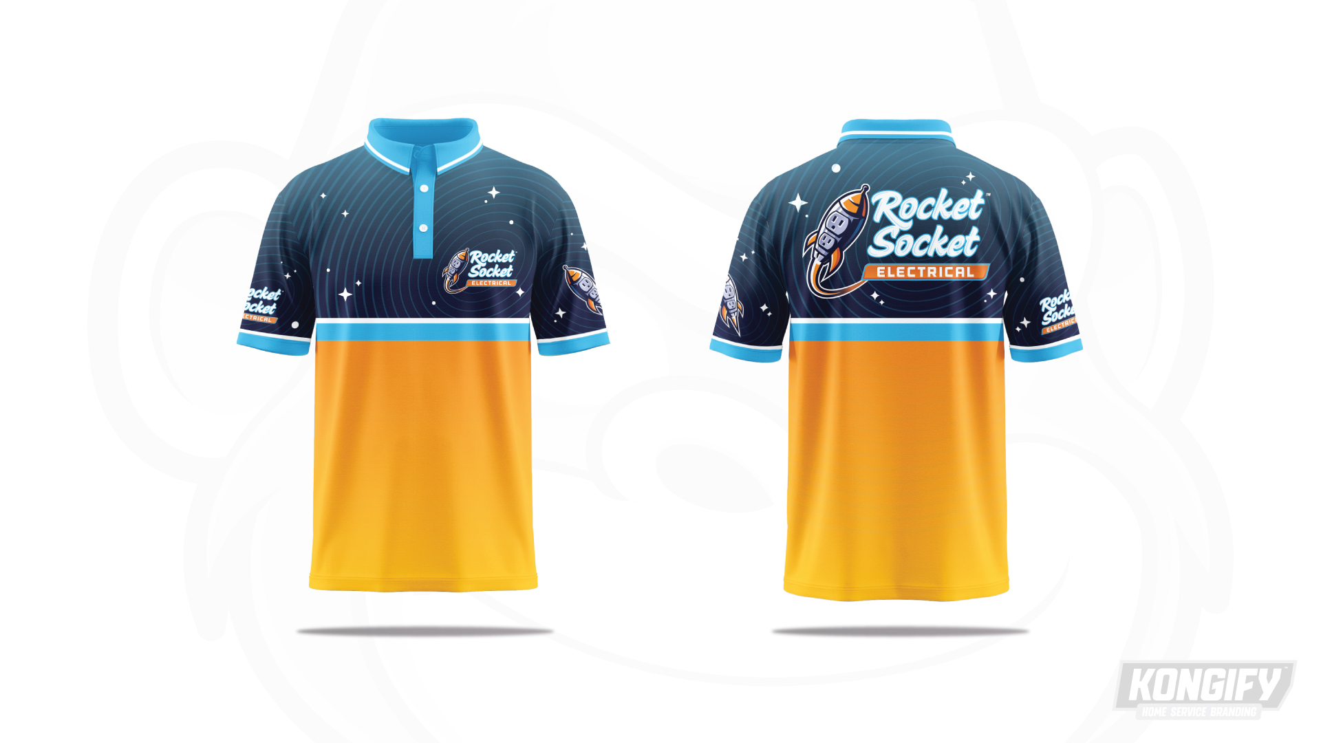
Stars and curved lines cover the polo’s dark upper half, surrounding the chest and back marks. The orange base gives the busier upper design a simpler area below.
A bright blue dividing stripe and matching trim repeat the icon’s outer edge. The shirt carries the space theme through its pattern, even beyond the full logo placements.
Explore the design work shown for this brand.
Source: The designs shown on this page.
Meet the Kongify team