Project details
The team behind the design
Explore the design work shown for this brand.
- Brand
- Sereney Disaster Cleanup
- Work shown
- Logo Design, Truck Wrap Design
- Design team
- Kongify
Source: The designs shown on this page.
Meet the Kongify team
Sereney pairs a broad wordmark with a rounded S badge. An arrow fits inside the initial, adding direction to the compact mark, while teal and dark blue connect the symbol to the service line.
The S supplies a compact version of the Sereney name. Its lower opening forms an arrow, built into the letter instead of added beside it. The wider wordmark and framed Disaster Cleanup line provide a horizontal partner to the badge.
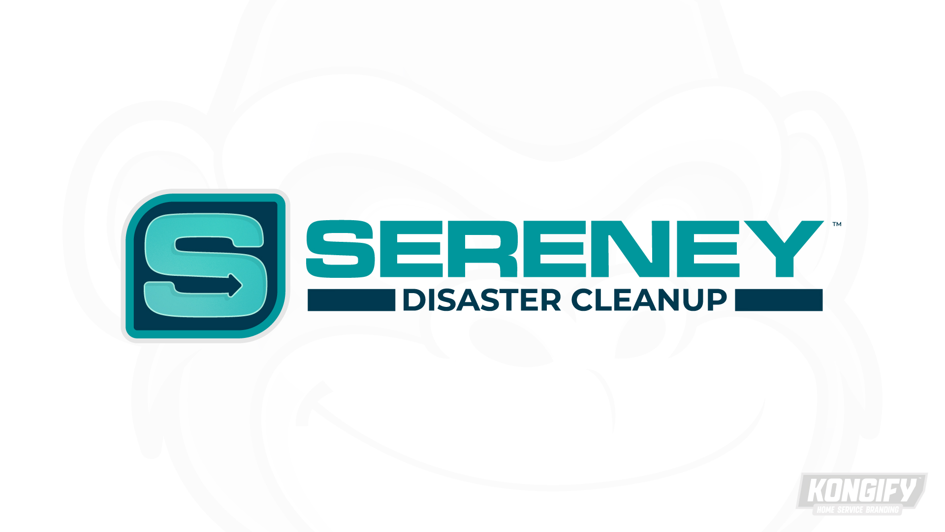
The rounded S contains a right-pointing arrow in its lower opening. Its surrounding dark tile follows a similar rounded shape, keeping the detail within one compact badge.
The teal name uses broad, simple letters beside the symbol. Dark bars frame Disaster Cleanup below, balancing the shorter service description against the longer name.
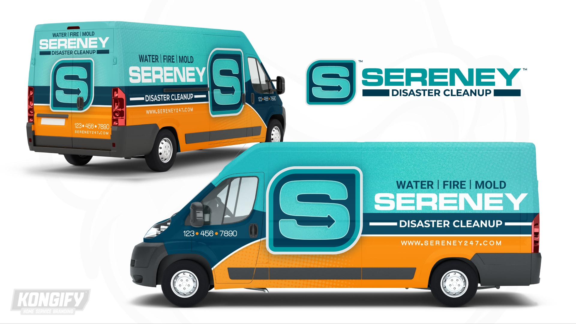
The enlarged S sits beside the cab, crossing the teal upper body, dark service band and orange lower area. A pale edge keeps the badge separate from those matching and contrasting fields.
The name and service wording form straight rows beside it. On the rear, the badge takes the larger central space beneath the words, adapting the wide side arrangement to a narrower view.
Explore the design work shown for this brand.
Source: The designs shown on this page.
Meet the Kongify team