Project details
Explore the design work shown for this brand.
- Brand
- Strong Sons Junk Removal
- Work shown
- Logo Design, Truck Wrap Design, Uniform Design
- Design team
- Kongify
Source: The designs shown on this page.
Meet the Kongify team
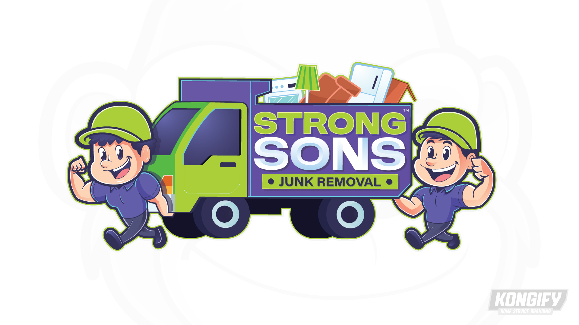
Strong Sons makes its name visible through two flexing characters beside a loaded junk truck. Furniture, appliances, and a separate service strip turn the playful group into a removal-work scene.
The paired figures give Sons a group identity, while their flexing poses illustrate Strong. A loaded truck between them connects that name to junk removal without needing a separate background scene.

The truck bed holds the Strong Sons name, with household items rising above it. A Junk Removal strip below the letters explains the same service shown by the load.
Matching lime caps and purple shirts join the two smiling characters. Their poses frame the truck, making the workers and vehicle one wide logo rather than separate decorative pieces.

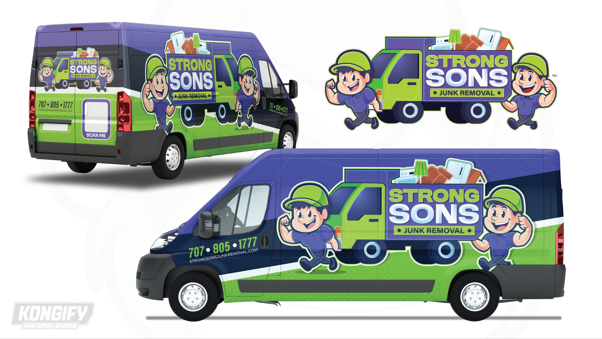
The loaded truck remains between both figures across the wrap. Keeping that group intact preserves the logo’s connection between workers, hauling, and the name on the truck bed.
Purple above and green below extend the main colors across the van. A pale dividing line follows the body’s length, separating the larger fields around the illustration.

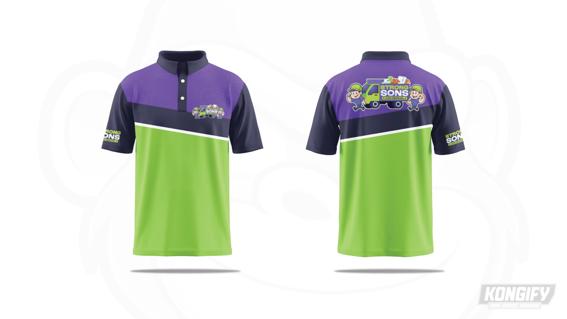
Purple shoulders meet lime below through a dark band and thin white line. These broad fields repeat the worker and truck colors around the polo.
Both chest and back graphics keep the two figures beside the loaded truck. The larger back version gives the household items more room, while sleeve marks repeat the name separately.
Explore the design work shown for this brand.
Source: The designs shown on this page.
Meet the Kongify team