Client Identity Reference

Vizcom Contracting Home Service Branding

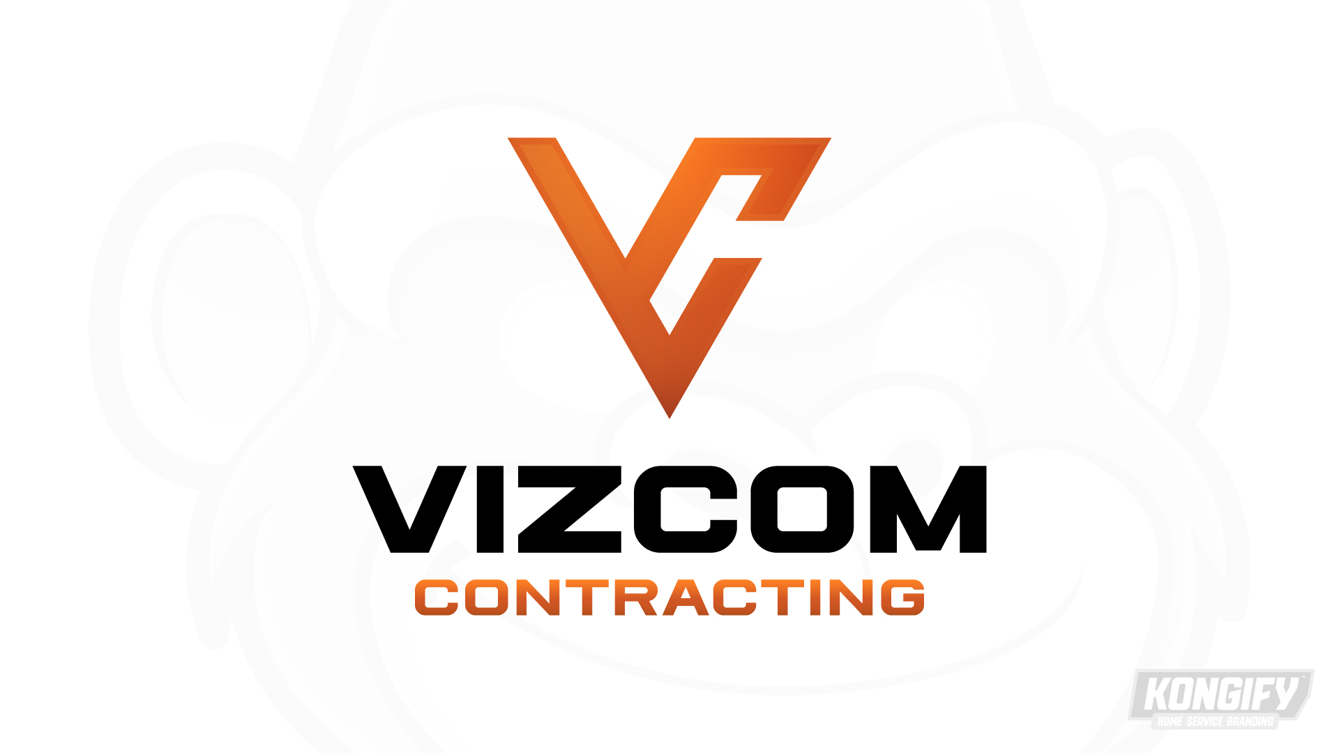
Vizcom’s client-supplied logo combines an angular orange symbol with bold black lettering. The orange Contracting line repeats the symbol’s color, connecting the compact mark to the full name below.

The supplied identity’s angles and color connections

This logo was supplied by Vizcom for use in its vehicle and apparel project. Its pointed symbol and wide lettering form a stacked identity, with orange connecting the top mark and lower Contracting line.

Vizcom’s client-supplied logo with an orange V-and-C-shaped symbol, bold black Vizcom lettering, and orange Contracting below.

An open center separates the symbol’s angled parts

The orange symbol uses a pointed V form with a smaller open shape along its right side. The pale opening keeps those angled parts distinct within one compact outline.

Bold black Vizcom lettering creates a wide base below the symbol. Contracting sits beneath in orange, repeating the mark’s color and completing the vertical grouping.

About the artwork

This page shows the client-supplied logo used as a reference for Vizcom’s vehicle and apparel project.

Brand
Vizcom Contracting
Work shown
Client-supplied logo
Artwork source
Supplied by Vizcom

Source: The designs shown on this page.

Meet the Kongify team