Restoration Branding Portfolio

24 Restore Home Service Branding

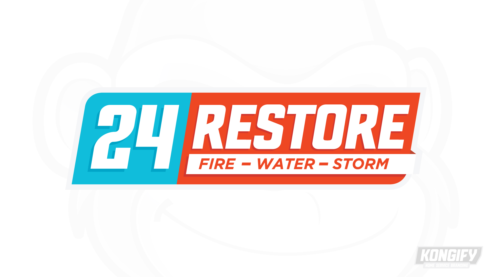
24 Restore builds its design around a large number and a bold word. Cyan and orange separate those two parts, then become the main color fields across the applications.

Two blocks hold one complete name

“24” and “Restore” each have a contrasting color field. Their shared white lettering and forward slant join them as one mark. The shorter service line explains the work beneath “Restore.”

24 Restore logo with a cyan number block and orange Restore panel above the service line.

The number has its own space

The large white 24 fills a cyan block beside the orange Restore panel. Matching slants in the lettering and panel edges give both parts the same direction.

“Fire – Water – Storm” sits on a white strip below the word. That separate line explains the services without breaking up the main name.

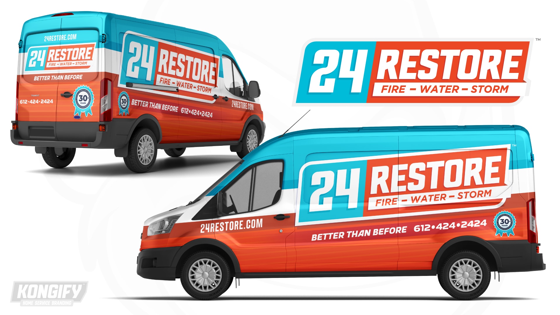
24 Restore van wrap design mockup with cyan, orange, and white panels.

The color blocks expand across the van

The full mark spans most of the broad side panel. Its cyan and orange fields repeat in the larger wrap, with a white band separating the upper and lower areas.

The main name sits above the tagline and phone number. On the rear, the same groups fit a narrower space, preserving the order while changing their proportions.

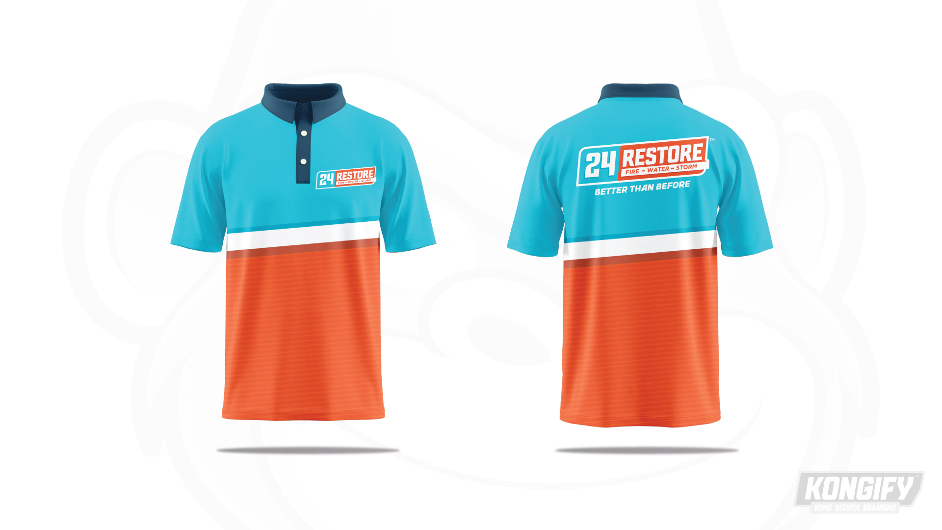
Front and back of the 24 Restore polo design with cyan and orange panels.

The logo’s colors become the shirt’s structure

Cyan fills the upper polo and orange fills the lower half. A white dividing band echoes the strip beneath “Restore,” expanding a small logo detail across the shirt.

The chest carries a compact mark, while the back pairs a larger logo with “Better Than Before.” A navy collar frames the bright upper field without adding another main color block.

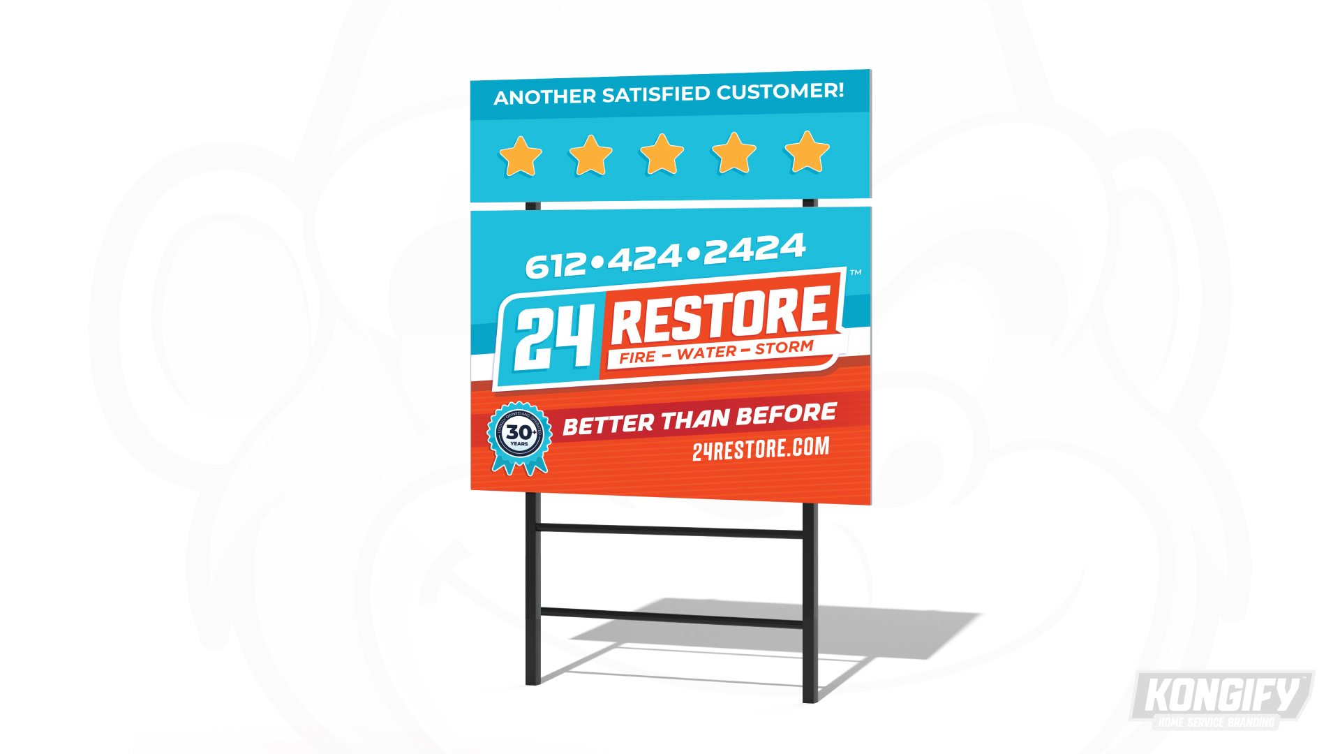
24 Restore yard-sign design mockup with the logo, service wording, and contact details.

A central name with contact details above and below

The yard sign gives the phone number space above the full logo. The orange lower field carries the tagline and website, keeping the name at the center of the layout.

The white band passes behind the mark, separating cyan from orange. This repeats the van’s broad structure in a shorter, nearly square format.

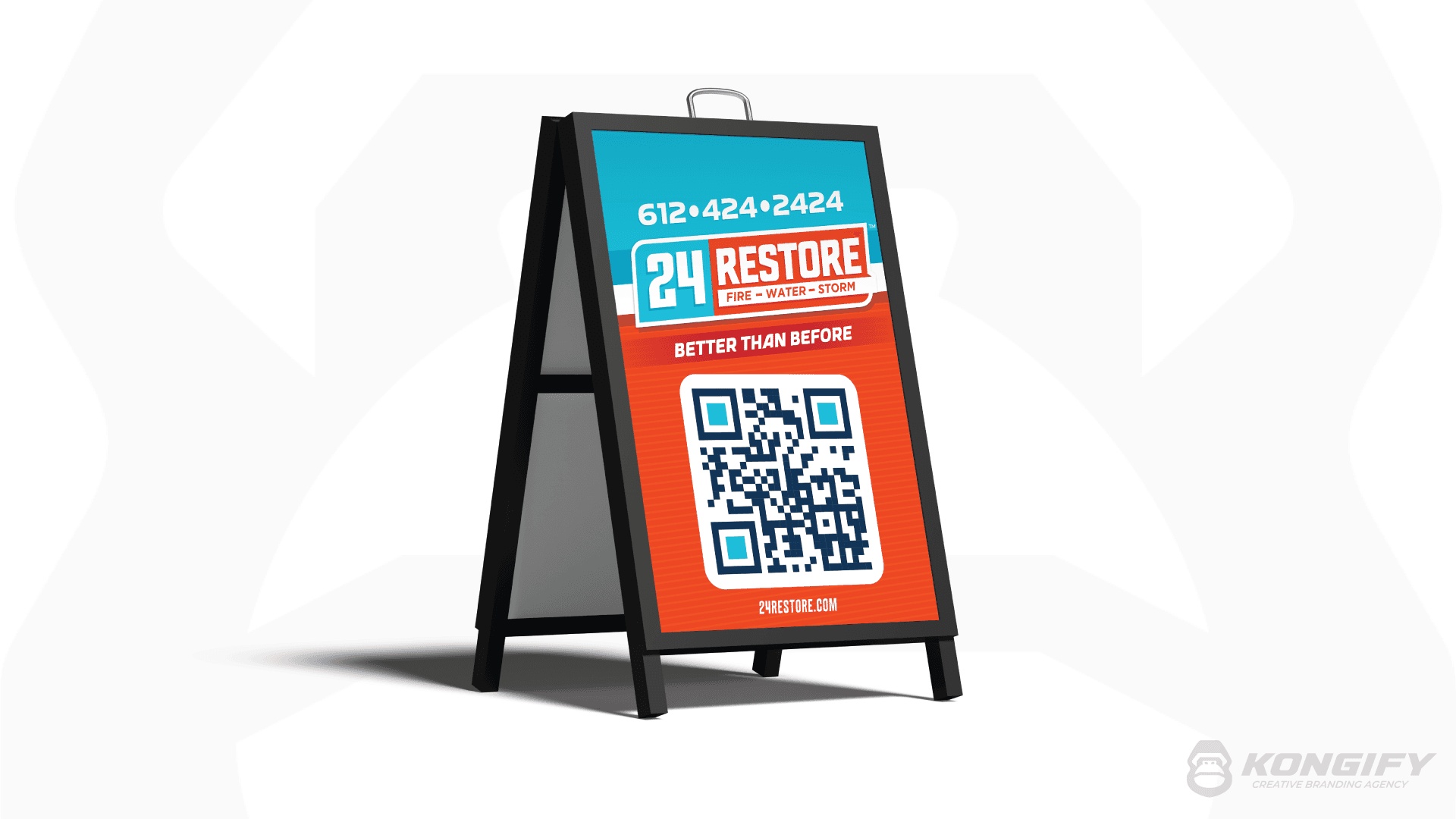
24 Restore A-frame design with the logo, phone number, brand message, and QR code.

A tall format with distinct information groups

The A-frame stacks the phone number and logo above the tagline and QR code. The cyan upper area identifies the brand, while orange holds the larger contact step below.

A thin white divide and the website at the bottom keep the stack organized. The same slanted mark remains intact even though the surrounding layout is vertical.

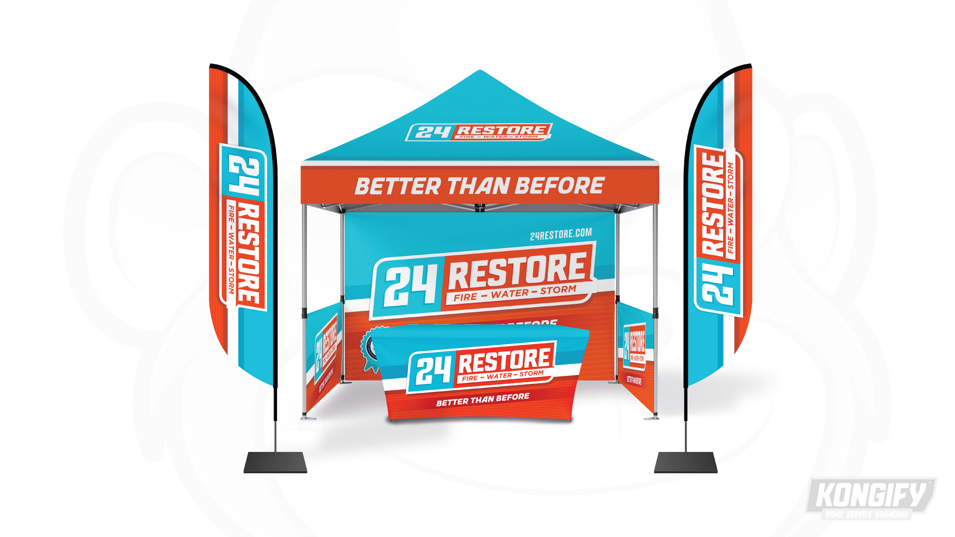
24 Restore canopy, flags, backdrop, and table-cover design mockup.

A wide name that also works vertically

The canopy puts “Better Than Before” across an orange front edge. The backdrop and table cover repeat the horizontal name over broad cyan and orange fields.

On the flags, the full mark rotates to fit the tall format. The adjacent color strips follow that direction, adapting the design while keeping both parts of the name together.

The team behind the design

Explore the design work shown for this brand.

Brand
24 Restore
Work shown
Logo Design, Truck Wrap Design, Uniform Design, Yard Sign Design, A-Frame Design, Trade Show Design
Design team
Kongify

Source: The designs shown on this page.

Meet the Kongify team